Title
To start I am going to be creating a title for the ending where it displays when the movie is coming out and the film companies which helped create the movie. This is a vital part of the trailer because all trailers have this part within their trailers (like the parental awareness clip which I used at the start of the clip, mainly online, but still worth having). So it is worth having it. and making it.
So, to create this title I went to Title > New Title > Still Default. I then named the title as 'Ending Title'. After clicking OK this then brought up the title menu. Here is where I am able to create the title. Unlike the previous titles i have created I am going to be leaving the background black. This is because it is more dramatic, even thought I like the paper effect on the previous titles; it does not give of the dramatic look (mentioned above) but also is not as a dynamic as a bold still colour. Also I feel that the bold black will really bring out the colour of the writing and the company logos.
First of all I added text to this title. I did this by using the Text Tool the text tool icon looks like a capital T on the left hand side tool panel. I selected this tool and then clicked on the creative title panel. I then typed the words 'Coming Soon'. I then highlighted the words and changed the font to Parchment. This font was really different to the usual fonts which they use for ending trailers, which was what I liked about using it. What I also liked about the font was that it was dynamic and bold which was some of the effects which I was after, but is of course still readable; also it fitted really well with the theme and story line of the film. I then changed the size of the font to 150 this was big enough that you can see the font, but then it was not so big that it can off the title all together. I then changed the colour of the text to white. This made the title more dynamic and bold and also so that the viewer is able to see the writing. I then used the Selection Tool (icon looks like a mouse arrow on a computer) and repositioned the text to where I wanted it at the top of the title.
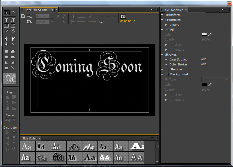 |
| Coming Soon text added to the title |
Now I am going to be adding the company logos onto the title. I did this by right clicking on the title and then going to Graphic. I then went through the system and found the documents which I wanted and added it onto the title. I did this for both of them. I then used the Selection Tool to then reposition them and resize them till I was happy with the results. I did not make them too big that they took up a lot of the title, but I did make them big enough that you could see the writing on the logos themselves.
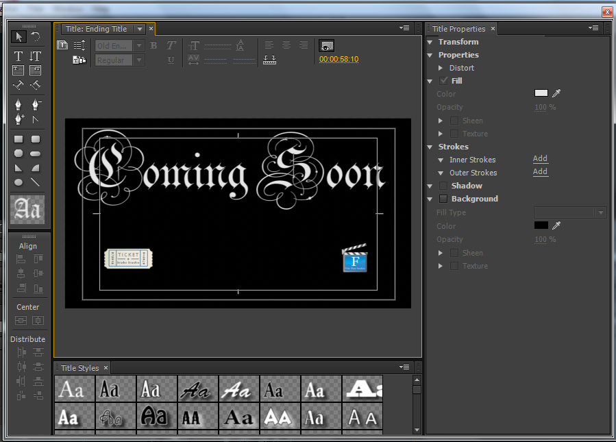 |
| Logos added to the ending title |
I then decided to add a bit of text in between the logos. I thought this would fill the gap between the two logos, but also add a bit more than just the text and logos. Again I used the Text Tool and clicked on the title panel itself and typed the words 'In 2D and Digital 3D'. I highlighted the text and changed the colour of the text to white so I and the viewers are able to see the text. I then changed the font too .. I changed the font different from the one I used before for the top text because I felt that it would have been too much. I also changed the size of the text to 100. This was small enough that it fitted in between both logos but still big enough that you were still able to read it. I then repositioned the text using the Selection Tool. Here is the result of the title.
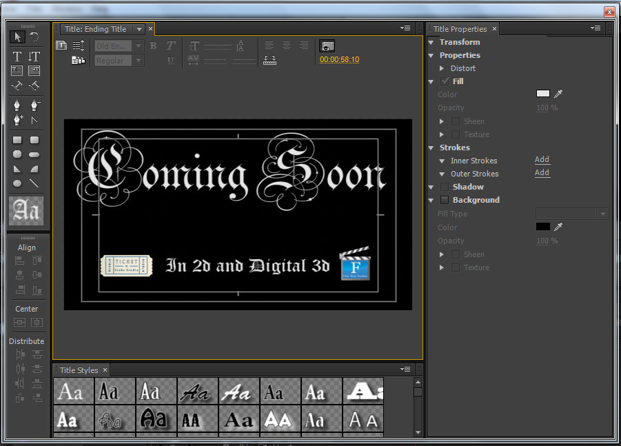 |
| Text added to the title in between the logos. |
I looked at the results of the title and found that I was not happy with it. There was something about the title which I did not like. I finally found that it was both the extra text which I had added and the logos. I felt that the logos were brought out on the title that it made both the title and logos look really tacky and unprofessional. The second text I was not sure about it, I felt like that there was too much text on the title. I think this is due to the coming soon being so large in font size that it makes anything else you put on the title look too much. So, I decided to remove the logos and extra text and reposition the 'Coming Soon' into the centre of the title panel and I found that I was much happier with the result and that it looked really good on its own. Here is the is the final title.
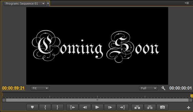 |
| The final result and look of the ending title. |
I then dragged the title onto the timeline so that the end of the title length was exactly on the 1 minute mark. I then looked at the title on the timeline and instantly realized that the clip itself was too long to be and ending title. So, I then selected the Razor Tool and cut the clip so that it was one second long. I choose one second because I felt that was enough time to leave this title on the screen, also I felt two seconds was too long still, where I could use that second to add an extra bit to the trailer.
 |
| Razor Tool used to cut the long title clip to one second |
Tools used in this Post:
- Title
- Text Tool
- Selection Tool
- Add Graphic
- Razor Tool


No comments:
Post a Comment