Amaray Paper Sleeve Dimentions
I have now decided to look up the dimensions of the Amaray paper sleeve before getting into the creative/designing stage of the process. This is so I can get on an idea how big pictures/images need to be, how textures would look against it, also can see how the design would look on back as well as the front.
I did some research about the bleed margin and found out that; the bleed margin is an extension of colour, photo or a design element past the cut line. The line is used to far print shop purposes a margin of error when trimming, so if the cut is a little off, the white of the paper will not show along the edge.
Now to start creating the template for the paper sleeve. To create the dimensions for the sleeve I must start by opening the program and clicked File > New. This will bring up a menu where I will enter all the details in to create the template for the sleeve. Firstly before I enter any dimensions I must work out how big I want my bleed and safety margins to be; which will mean I have to add the bleed and safety margin measurements on top of the dimensions I already have for the sleeve.
What I like about the cover and are the colours. I like how the light blues and greens work really well with the black background. It shows that the film must have a dark and mystical side to the story, but also it also shows there must be some water involved in the story line; mainly due to the blue and green colours on the cover.
I
like the look of the main character being displayed on the front cover.
I also like how all the images work together even though there quite a
few of them. I like how they work with the background colour. As well I
like how the cartoon images work with the real life picture.
I like the back cover, I like how they used a book on the back cover to introduce the story. This is something that I might consider using in my design for the back cover. I also like how they kept the colour theme going onto the back ground. I like how the image is also simple and does not overpower the back cover but it looks really effective and brings the back cover together. I also like the idea of not having any screenshots on the back cover. It makes you feel that you want to watch it and see what happens, even though the screenshots give that kind of impression as well; it is not the same with them.
Image References:
Design Idea One - Ink/Splatter Effect
This
is my first initial design. It was inspired by a picture of ink on
my moodboard. I then through what if I could make the character(s) look
like they are an ink splattered image!? This would make the cover look
more interesting and dramatic than just having plain images just stuck
here and there. Also, I thought it would make the image look old and
faded, and almost like there were mistakes or ink smudges where
the artist would have drawn the picture.
I thought the splatter image would be placed on an old piece of paper. The paper would look quite effective with the splatter effect because it will go well with the worn theme. Keeping to the worn theme I have also decided to make the title of the film worn out. This will help make out the title has been faded over time along with the paper and the image.
I
have looked up some tutorials before I begin my design process this is
because it then will allow me to see what I like and what I don't like
and also what I will implement within the design from the tutorials. By
doing this I will recreate the tutorials, this will give me an idea of:
one) what the effects look like and two) how well they will work
together.
Tutorial One - Splatter Effect
This is the video tutorial which shows you how to create a splattered effect.
Here is the
result of my second trial design. For most of the part, this design is
part of my original design apart from the background, which is part of
my other ideas (book). What I like the most about my design is that it
works really well in the sense of the idea. I also like how the ink
brushes works on the cover as well, making it look as if the book has
got damp and ink from the image has smudged across the cover. This
really ties in well with my worn/faded theme. I also think that the book
texture works really well as well. It looks really effect and the book
looks really old from the image that was used.
The only thing about the book texture is that it makes the image look really blurry. I am not sure if it is the colour of the book. However, if I was to take this design further I would have used a brown cover; but as I was experimenting I thought I'd give it a try. Also the image, I am not sure if it was because I only copied and pasted the image across rather than copied and paste special. This is because the paste special keeps the resolution of the image in place. As well I think I went a little to far with the splatter brushes, which I think makes the image more blurry; because I used it to much then necessary.
I used the erasing of the title, which was an effect which I liked; however, it looks really blurry. I am not sure if it was effects that I used for the title, or whether it was the colour and texture of the background that I used. However, I like the effect it does work really well. If I was to change my background, it might have worked better.
Opinions on Trials
What I do not like about the image is the colour I used for the image of the girl. The ideas of using the colours works well, however I don't think that the colour that I have used for the trial does not work very well. I think this is because its does not go with the theme of the idea/story, maybe using a faded colour effect might work better.
I also like the of blending the idea however, I do feel that I went a little too far with it within this design. For instance, the five star rating I feel that I have made it to dark which blends in with the border, but too dark together for the lighter colour of the paper effect. Also I feel that I have made the four star rating to blended as well, this is because it is at the same grey scale as the image of the girl.
I also like the idea of the writing going across the page, however, it did not work the way I intended it too. I am not sure if it the colour of the writing or whether it is because the effect only looks right just on the image. I am also not sure about the colour of the image that changing it to black & white scale helped the image, maybe making it a similar colour to the paper might help it look better.
 |
| Example of an Amaray case |
An Amaray case is plastic storage case which stores DVD or games discs from damage. To sell the film or game they create a paper sleeve for the case. This is a way to promote the game or film by giving the product a desirable approach for customers to purchase the contents. It also gives a description and screenshots of the game/film to give it more interest to the customer.
I have done some research about the dimensions of the paper sleeve. The overall size of the case is 273 mm wide x 183 mm high. This allows the spine are to be 14 mm wide which is standard size. The front and the back panels are both 129.5 mm x 183 mm. The website I used also mentioned about a 3 mm bleed margin.
 |
| Example of the bleed, safety and cut margins |
When researching about the bleed line I also found out that i also require a safety margin. it is the opposite of a bleed margin. It keeps important elements inside the cutting marks. So each template has guidelines set up so you can see exactly how much safety margin to allow.
 |
| The New menu which loads when selecting the new button |
So I have decided to create a bleed margin of 3 mm and a safety margin of 2 mm. I choose 3 mm for the bleed margin because; one the website I found the dimensions for the sleeve recommended 3 mm. Two was because I thought it would be a safe amount of room in case of error. This is because if it was 1 mm then the cut will most likely show through in white. I also choose 2 mm for the safety margin because I though 2 mm would be enough to protect my content without the room for error which maybe a 1 mm safety margin would allow. So this would mean that the overall measurements of the sleeve would be 283 mm x 193 mm; meaning that I will change the measurements from pixel to millimeters.
I have also change the resolution from 72 to 300. This is because when printing out a document, they recommend that you change you resolution to between 300-600 for a better quality. Whereas a 72 resolution is mainly used for web purposes.
The colour mode was an awkward one to choose between, however after some research I found the colour mode to choose and that was to leave it at RBG. This is because it is mode that is used for monitors. I also kept the color mode to 8-bit, this was because I can use a wider range of colours when producing my designs; meaning that I don't have to stick with the same colours and can create a multiple of different tones.
The other colour mode was known as CMKY, the different between the two colour models; and understanding these differences can mean producing a greater product than a disappointing one.
The differences are that the RBG colour model is used by monitors, televisions, scanners and digital cameras. Especially monitors, which uses small bands of red, green and blue to generate colour. RGB is additive meaning that when you add three colours together you will get white; and when you turn off all three lights you end up with black. So by mixing certain amounts of red, green and blue you can create most colours. The paper of a magazine, catalog or a CD booklet can not generate light light a computer monitor can. It has to rely on reflected light and the subtractive colour model CMYK. When you add all the colours of the model you can generate a colour close to black, and when no ink is laid you get white.
I also choose RBG over CMYK because most printers, or print shops convert the colurs for you into the CMYK colour scale; meaning that I do not have to change the colour setting. But also it means that I can use RBG which is standard colour mode for monitors and also allows me to use a greater range of toned colours [As mentioned above].
The background contents is important. I changed it to transparent. This is because it is automatically unlocked. However, it also means that it will be easier to work with layers. Also I did not change any of the advanced settings because I felt they were not important or relevant to what I am going to be creating.
I can now click OK. When I do the canvas size should be displayed on the screen. Now I am going to create some guides for the template. These guides will allow me to see where all my bleed and safety margins are on the template, but also I will create guides to show me where the spine of the sleeve are. This will then mean I wont be putting images or writing etc, over and into the spine.
First of all I must set up rulers on the Photoshop. This will allow me to see where the guides are placed. To set up the rulers in Photoshop Click on View > Rulers. The rulers will appear across the top and the side of the work area of the program. However, the rulers are set to centimeters and I am going to be working with millimeters, so I need to change this by Double Clicking The Rulers on the Work Page > Change the Rulers from Centimeters to Millimeters > Click OK. Now the rulers are set up I can now set up the guides.
There are two ways to create guides in Photoshop. One way is via the ruler. To do this you click on the ruler and drag down a guide. There will be a little box by the mouse when dragging the guide. This tells you how many mm it is at. Once I am happy with the guide placement I let go with mouse and it is placed.
The second way which I used because it was more efficient and more accurate then dragging the guide from the ruler. I clicked View > New Guides and a little window opens up, this allows you to select whether you want the guide to be horizontal and vertical. This window also allows you to enter the measurements you wish to place your guides and does it, once you have clicked OK. Here is a table of measurements of where the bleed, safety and spine goes onto the template.
The colour mode was an awkward one to choose between, however after some research I found the colour mode to choose and that was to leave it at RBG. This is because it is mode that is used for monitors. I also kept the color mode to 8-bit, this was because I can use a wider range of colours when producing my designs; meaning that I don't have to stick with the same colours and can create a multiple of different tones.
The other colour mode was known as CMKY, the different between the two colour models; and understanding these differences can mean producing a greater product than a disappointing one.
 |
| An example of the difference between the RGB and CMYK model |
I also choose RBG over CMYK because most printers, or print shops convert the colurs for you into the CMYK colour scale; meaning that I do not have to change the colour setting. But also it means that I can use RBG which is standard colour mode for monitors and also allows me to use a greater range of toned colours [As mentioned above].
The background contents is important. I changed it to transparent. This is because it is automatically unlocked. However, it also means that it will be easier to work with layers. Also I did not change any of the advanced settings because I felt they were not important or relevant to what I am going to be creating.
So over all the menu that I opened to create a new document should now look like this:
 |
| How the New menu looks when all my information has been entered. |
I can now click OK. When I do the canvas size should be displayed on the screen. Now I am going to create some guides for the template. These guides will allow me to see where all my bleed and safety margins are on the template, but also I will create guides to show me where the spine of the sleeve are. This will then mean I wont be putting images or writing etc, over and into the spine.
First of all I must set up rulers on the Photoshop. This will allow me to see where the guides are placed. To set up the rulers in Photoshop Click on View > Rulers. The rulers will appear across the top and the side of the work area of the program. However, the rulers are set to centimeters and I am going to be working with millimeters, so I need to change this by Double Clicking The Rulers on the Work Page > Change the Rulers from Centimeters to Millimeters > Click OK. Now the rulers are set up I can now set up the guides.
There are two ways to create guides in Photoshop. One way is via the ruler. To do this you click on the ruler and drag down a guide. There will be a little box by the mouse when dragging the guide. This tells you how many mm it is at. Once I am happy with the guide placement I let go with mouse and it is placed.
The second way which I used because it was more efficient and more accurate then dragging the guide from the ruler. I clicked View > New Guides and a little window opens up, this allows you to select whether you want the guide to be horizontal and vertical. This window also allows you to enter the measurements you wish to place your guides and does it, once you have clicked OK. Here is a table of measurements of where the bleed, safety and spine goes onto the template.
Guides
|
Measurement
|
Vertical – Bleed Margin
|
3 mm
|
Vertical – Bleed Margin
|
280 mm
|
Vertical – Safety Margin
|
5 mm
|
Vertical – Safety Margin
|
278 mm
|
Vertical – Spine Lines
|
129.5 – 143.5 mm
|
Horizontal – Bleed Line
|
3 mm
|
Horizontal – Bleed Line
|
190 mm
|
Horizontal – Safety Line
|
5 mm
|
Horizontal – Safety Line
|
188 mm
|
After placing all these measurements in the guides window the final template will look like this:
Website References:
- DVD Cover Sheet Dimensions. Media and Copying, Printing and Duplication. [online] Available at: <www.mediacopy.co.uk/artwork_dvd_inserts.htm>[Accessed 20th February 2014].
- Bleed and Safety Margins. Disc Markers. [online] Available at: <http://www.discmakers.com/templates/faq.asp> [Accessed 20th February 2014].
- RBG and CMYK Colour models. Disc Markers. [online] Avaiable at: <http://www.discmakers.com/templates/faq.asp> [ Accessed 20th February]
Image References:
- Close up of a template showing the bleed and safety lines [Image online] Available at: <http://www.discmakers.com/templates/faq.asp> [Accessed 20th February]
- Some colours in RGB can become much duller in CMYK [Image online] Available at: <http://www.discmakers.com/templates/faq.asp> [Accessed 20th February]
Tuesday, 25 February 2014
Current DVD Covers and Moodboard
I have decided to create a moodboard of images, fonts and colours. This will give me an idea of the range of styles, techniques and tutorials I could use to create my DVD cover, CD cover and also the trailer. To do this I have decided to look at current DVD covers that are already out there about my subject idea; also I will be watching the film Ink Heart which inspired my idea as well as the DVD cover. This will show me the colours they used to represent their characters and the way they dress; which will show off their personalities. I will also be putting my own ideas and thoughts about the theme and what would represent it.
Current DVD's
Ink Heart
There
are many different versions of the DVD cover for this film depending on
which country you are in; however, I am concentrating on the English
version. What I like about the cover is the colours that is used as they
remind me of the colour of pages; especially the beige colours. They
look like the colour of old pages. I also like how the darker shades
work with the beige making it mystical and invigorating drawing me in as
it reminds me of evil, especially when it is around the castle.
 |
| English Version of the InkHeart DVD Cover |
I
liked the look of the sparkling glow that comes from the the book, it
makes it more magical and the book is coming to life. However, I do feel
there is a little too much going on the with the images at the top of
the glow. I feel there are too many, I think it is because it draws the
eyes and created another focus point. But overall I feel the front cover
gives the intention about the story.
The
back of the DVD cover is simple which is what I like. It has not been
overpowered with images and text. The way it has been laid out works so
well to give the viewer what they want to see; such as screenshots and
information about the film.
I
also like the way they represented the screenshots not in a straight
line but a swerving line almost like a wave. So it is not a straight
dull line it added a little character to the cover. I also like the
simple image they have used on the back screenshots which were there.
What I also liked about the back cover is that is the old worn paper
look which makes it look really effective; and also it goes with the
theme of the story.
The PageMaster
What I like about the cover and are the colours. I like how the light blues and greens work really well with the black background. It shows that the film must have a dark and mystical side to the story, but also it also shows there must be some water involved in the story line; mainly due to the blue and green colours on the cover.
 |
| The PageMatser DVD Cover |
I like the back cover, I like how they used a book on the back cover to introduce the story. This is something that I might consider using in my design for the back cover. I also like how they kept the colour theme going onto the back ground. I like how the image is also simple and does not overpower the back cover but it looks really effective and brings the back cover together. I also like the idea of not having any screenshots on the back cover. It makes you feel that you want to watch it and see what happens, even though the screenshots give that kind of impression as well; it is not the same with them.
Moodboard
Here
is my mood board which I created with inspiration from the current DVD
covers and watching the film; as well as ideas of my own.
 |
| My moodboard of Images, colours and fonts. |
- InkHeart English Version DVD Cover [Image Online] Available at: <http://dvd.box.sk/newsimg/dvdmov/max1251846878-frontback-cover.jpg > [Accessed 24th February 2014]
- The Pagemaster DVD Cover [Image Online] Available at: <http://www.covershut.com/covers/The-Pagemaster-1994-Front-Cover-80486.jpg> [Accessed 25th February 2014]
Sunday, 2 March 2014
Front Panel Design Process And Tutorial Research
In
this post I will be showing my ideas for the cover of the Amaray sleeve
case. This post will mainly cover the front panel design. This is
because the back panel will be done separately from the front because I
want to try and experiment with both panels. But also if I was to change
the back panel idea then it would make the whole process confusing. The
back panel will be the same on both designs, so when I make the final
front cover and the final back cover I can then incorporate them
together.
I
will also include a section on self-taught tutorials that I have
researched based on the design which will help me create the effects
that I want. As well as this, I will also have a section on other ideas
on the design. I know I have drawn up and initial plan for the design,
however, I also had thought's about what would the design look like if
it had a different background etc. So I will also include these ideas
into the designing process.
Design Idea One - Ink/Splatter Effect
 |
| Design Idea One with Back Cover Design |
I thought the splatter image would be placed on an old piece of paper. The paper would look quite effective with the splatter effect because it will go well with the worn theme. Keeping to the worn theme I have also decided to make the title of the film worn out. This will help make out the title has been faded over time along with the paper and the image.
Self Taught Tutorials - Experimentation for the Design
Tutorial One - Splatter Effect
This is the video tutorial which shows you how to create a splattered effect.
 |
| This is the image I recreated when following the video tutorial above |
Tutorial
one was based upon a splatter effect. This tutorial was very simple to
follow making it easy to reproduce. In recreated the tutorial and it
went well. What I like about the reproduce image is that it was the
exact effect i wanted for my design. The person in the image looks like
they are disintegrating and the rest of them is splattered across the
page; just like an ink spill. One big splat and lots of little ones that
follow. However, with the image I created I feel I went a little to
crazy with the splatter brush. This ended up overpowering the image; but
for what I want to use the effect for, it has served its purpose. I will be implementing the tutorial into my design by recreating the effect onto the main image of my front cover.
Tutorial Two - Old Paper
This is the video tutorial which shows you how to create an old paper effect.
 |
| This is the image I recreated when following the video tutorial above |
The
second tutorial was based on how to create an old paper effect. This
tutorial was also very simple to follow and also created the effect I
wanted to make the page look worn. What I like about it is the way the
layers work together to create the effect. how the darker shades of the
cloud render come through the lighter colour; which gives it a worn and
almost burnt effect. The only thing about the image is the border. I
like how it off a singed edging on the paper, but it looks tacky even
though it is there for that reason. I will be implementing this tutorial
by using the old paper effect to create the background for my design. I
am not sure whether I will also implement the border; I might
experiment with it and see what it looks like at different sizes.
Tutorial Three - Ancient Ink Effect
The
step by step guide can be found at
: http://www.psdvault.com/text-effects/create-a-dissolved-ancient-ink-text-effect-in-photoshop/#prettyPhoto
 |
| This is the image I recreated when following the step by step tutorial above |
The
third tutorial was to create an ancient ink effect. This tutorial like
the others, was easy to follow and created a good effect. However, I am
not fond of the final result. I did not like the whiting/lighting effect
behind the text. I am not sure if it was the way I used the effect and
it didn't work or if it just looks too much to begin with. I also don't
think I will be taking the emboss, inner glow and shadow into effect
either. It looks good, however I just want a fading dissolved effect
which the rubber provides on its own; which personally I like the look
of on its own. It also makes it less over powered, but still gives off a
great effect without the need of backing light and other effects.
I
like the concept of using the layers in aid to remove some of the text
with the rubber. This then allowing only the text to be affected rather
than the whole image; but using the rubber on as a whole. It allowed me
to create an old faded effect on the writing by erasing the edges of the
text. The other idea which the tutorial used, was incorporating ink brushes to
the design. This made the paper look as if ink was smudged onto the
paper, or the ink got wet and then was smudged. These techniques will be
things which I will incorporate into my design to give the page an even
more faded look without over powering the image as a whole.
Other Ideas for the Design
I
have had many thoughts and other ideas in which I could take this
design. First of all, I thought about having a book texture rather than a
paper texture instead as the background. I thought then I could make
the whole case look like a book, with the back panel and the spine made
to also look like a book. It would still have the same effects as the
piece of old paper, except it would be on a book. I thought this would
make a good effect because it is a very old story which would have been
passed on, so it would need to some wear and tear; which will work
perfectly with the effects which I want to try out.
I
also had a thought about using more than one image, to use with the
splatter effect. I thought this might also make it more dramatic and
also show all the characters in the story. But also it might make the
overall design more filling too, so it will fill the design template.
However, I will do it so that it will not overpower the whole design,
but is still effective.
Self Taught Tutorials - Experimentation for the Design
I have looked up some tutorials before I begin my design process this is because it then will allow me to see what I like and what I don't like and also what I will implement within the design from the tutorials. By doing this I will recreate the tutorials, this will give me an idea of: one) what the effects look like and two) how well they will work together.
Tutorial One - Text Poster
The step by step guide can be found at: http://www.photoshopessentials.com/photo-effects/text-portrait/
Other Ideas for the Design
Design Idea Two - Text Effect
 | |
|
This
is my second design. It was inspired by the film cover that I have
recently seen within my movie collection called The Matrix. I liked the
effect they used for the coding where it was trailing down, it made me
think maybe I could use that sort of effect on an image!? Maybe using
text from a book and placing it over the image!? It would make the
cover more modern and different from traditional colours and textures
that are used for book kind of stories. I also want to make the person a
different colour, which is also modern but also stand out against a
black background. The design is going to simple, but I want the colours
to make it stand out.
I
am going to be using the faded effect still like I decided for design
one. It will most likely to be white. This is because it will stand out
brilliantly against the black but also I don't want to much colour
against the image which will be colourful. As well as the image, I don't
want it to colour out or blend in with the ring of fire effect I want
behind the logo.
Self Taught Tutorials - Experimentation for the Design
I have looked up some tutorials before I begin my design process this is because it then will allow me to see what I like and what I don't like and also what I will implement within the design from the tutorials. By doing this I will recreate the tutorials, this will give me an idea of: one) what the effects look like and two) how well they will work together.
Tutorial One - Text Poster
The step by step guide can be found at: http://www.photoshopessentials.com/photo-effects/text-portrait/
 |
| This is the image I recreated when following the step by step tutorial |
The
first tutorial was to create a text poster. The tutorial was easy to
follow and created the effect it said it was going to effect. To an
extent. I like the way the words are used to define certain parts of the
image leaving an outline of certain detail. However, I feel that the
effect did not work as well as I hoped. When you look at the tutorial
Image they have created you see all the features of the persons face
really clearly. Yet when I did it, you can just about see where some of
the persons facial features are it not till you really focus on the
picture.
What
I really do like about it is that layered effect it almost gives. For
instance, the background looks like it is the furthest away. So the more
features that are closer the more they stand out like a top layer. I
also like the colour that I used in the picture, it looks really nice,
it is not to bright but it is not to dark, but enough to make the
picture stand out.
Tutorial Two - Text Portrait
This is the video tutorial which shows you how to create a text post portrait.
 |
| This is the image I recreated following the video tutorial above |
The
second tutorial was to create a text portrait. The tutorial was easy to
follow and created the effect it said it was going to. I really like
this effect I like how you can take any image and create this effect. As
well as this I like the way the text follows the facial features of the
portrait giving it a more natural way of producing this kind of effect.
But I also like the way the features of the face are still there and
are really clear so you can tell who the person is within the picture. I
also like how the back ground is just a plain colour and will be
affected by writing making the colours and the text stand out more.
Decision on Tutorial to Use
Out
of the two text posters/portraits I will be using the second one. This
is because the effect is much better for what I want. They are both
clever ways of creating the same sort of effect, but the second one
catches my attention more. This is because it keeps the features of the
face and is much sharper than the first one, which you can just make out
where the features are.
Other Ideas for the Design
I
have had a few thoughts and other ideas in which I could take this
design, this is just another overall design. First of all I thought
about changing the background to an old paper effect. I thought this
would then stick to the theme a little more as much as the black works
with the effect. I also thought about making the main character picture
black and white rather than colour. This will then make the old paper
effect stand out, as well as the image.
Another thought was that maybe I will leave the writing to carry on across the page almost as if the text was printed on a scrap piece of paper which faded over time. Also I will try the title without the ring, this is because it will make the cover a little tacky because it will not blend in very well with the paper background. But I will keep it vertical to see how it will look.
Another thought was that maybe I will leave the writing to carry on across the page almost as if the text was printed on a scrap piece of paper which faded over time. Also I will try the title without the ring, this is because it will make the cover a little tacky because it will not blend in very well with the paper background. But I will keep it vertical to see how it will look.
Splatter Tutorial
Website References:
- Eric Schaap, 8th September 2012. Photoshop Splatter/ dispersion photo manipulation Tutorial Available at: <www.youtube.com/watch?v=cbd21dGAPMM> [Accessed on 14th February 2014].
- Splatter brushes [Online Download] Available at: <www.c130.deventart.com/art/splatter-brushes-20653473> [Accessed on the 14th February 2014]
Image References:
- Model.[Online Image] Available at: <www.digitalartsonline.co.uk/tutorials/photoshop/eroded-fashion-portraits/#/> [Accessed on 14th February 2014]
Old Paper Tutorial
Website References:
- Howard Pinsky, 24th June 2013. Photoshop: Stained, Old Paper Texture Available at: <www.youtube.com/watch?v=HdcchbCbkiw> [Accessed on 14th February 2014].
Dissolved Ink Effect Tutorial
Website References:
- Sumi Ink 001 Photoshop Brushes.Ink Brushes [Online Download] Available at: <www.brusheezy.com/brushes/1183-sumi-ink-brushes> [Accessed on 14th February 2014]
- God of War Font [Online Download] Available at: <www.dafont.com/godofwar.font> [Accessed on 14th February 2014]
Image References:
- Paper texture [Online Image] Available at: <www.texturetaddka.com/torn-tattered-paper-textures> [Accessed on 14th February]
Text Poster Effect Tutorial
Website References:
- Text Poster Effect [online] Available at: <http://www.photoshopessentials.com/photo-effects/text-portrait/> [Accessed on 19th February 2014]
Image References:
- Axl Rose [Online Image] Available at: <http://defendingaxlrose.files.wordpress.com/2011/12/axlroseaxlrose5.jpeg> [Accessed on 19th February 2014]
Text Poster Portrait Effect Tutorial
Website References:
- Text Poster Portrait Effect [online] Available at: <https://www.youtube.com/watch?v=pBGXksqYzeQ> [Accessed on 19th February 2014]
Image References:
- Axl Rose [Online Image] Available at: <http://defendingaxlrose.files.wordpress.com/2011/12/axlroseaxlrose5.jpeg> [Accessed on 19th February 2014]
Friday, 7 March 2014
DVD Front Cover Design Idea 1 Trials
This
post is going to be about my first design idea (splatter effect). As I
have had many ideas for this design I have decided to create several
trials based on them. This will then allow me to experiment with the
ideas I have and see what works and what does not.
Trial Designs
Trial Design 1
 |
| Design Trial 1 |
Here
is the result of my first trial design. This design was part of
my original drawn design which was easy to create due to the tutorials.
What I like most of all about this design is how the effects work
together so well. The paper looks realistically old and worn, which
really goes well with the ink brushes; as well as the ink splatter
effect. It makes the image look more worn an old which was the effect I
was going for.
Even
though I did not like the border from the paper tutorial I incorporated
it into the design. However, I did not make it as large of a border
which made it look better and less tacky; but kept the worn edging
effect in place. This was because it looked good and made the edging of
the paper look worn.
I
also feel just the erasing of the title really worked like I stated in
the Ancient Ink tutorial. I felt that if I used the whole tutorial it
would have been too much; it would have taken the focus away from the
image as a whole. Also I like the way that I tried to blend the star
ratings of the film into the image as well. I used the blending
techniques which worked really well and made them part of the image.
Trial Design 2
 |
| Trial Design 2 |
The only thing about the book texture is that it makes the image look really blurry. I am not sure if it is the colour of the book. However, if I was to take this design further I would have used a brown cover; but as I was experimenting I thought I'd give it a try. Also the image, I am not sure if it was because I only copied and pasted the image across rather than copied and paste special. This is because the paste special keeps the resolution of the image in place. As well I think I went a little to far with the splatter brushes, which I think makes the image more blurry; because I used it to much then necessary.
I used the erasing of the title, which was an effect which I liked; however, it looks really blurry. I am not sure if it was effects that I used for the title, or whether it was the colour and texture of the background that I used. However, I like the effect it does work really well. If I was to change my background, it might have worked better.
Trial Design 3
 |
| Trial Design 3 |
Here
is the result of my third trial. For most of the part, this design is
part of my original design apart from the images, they are part of my
other ideas (images). What I like about the design is the images. I like
how they work altogether, and they make the front cover more
interesting and dramatic because it shows more of the characters within
the story. I also think that the images work really well with the
splatter effect. It does not over power the images but it looks
effective and really cool. The only thing about the images is that I
will need to move them all together more. This will then narrow the gap
between both the Lara image and Conard image, but also enough that it
does not show the bottom of where the witch image ends. I also will next
time make sure that all parts of the image are still there.
I
also experimented with the paper effect. I decided to change the filter
gallery effect. I don't really like the effect it gives, especially
with the title. It makes it look more blurry than it should be, unless
it is the effect that was used. The effect on its own does not look as
appealing as it did on the first trial. I feel it makes the paper look
to rough and it kind of makes it look like some sort of arty paper
rather than basic paper which people write on. I did another experiment
but with the border again. I made it bigger to see what it looked like
with everything, however, it made it even more tacky than it looked in
the tutorial.
Opinions on Trials
I
have asked several people for opinions about my trial designs. I did
this because I wanted to see what other people thought about the
designs. This is will then help me determine what works and does not in
others peoples eyes. It will allow me to see what drew their attention
and what they feel needs perking up a little to draw them in deeper.
Here are a few comments which were made about each of the trial designs:
Here are a few comments which were made about each of the trial designs:
Trial 1
'I
feel this cover reminds me of the medieval period mixed with a sense of
magic I like the way that the character fades looked phenomenal.
However, I feel there are a few things that could be improved. Firstly
the stars. I feel that the stars should stand out more, maybe like a
bright red. I also think that the background should be darker and the
main image to be lighter. This will then make the main character stand
out more from the background picture.'
'For
this design I like the use if the effect of the splatter effect from
the image. however, I am not keen on the stars. I think they blend in
more than needed too. I also think that the text is a little unclear
where you've put ink marks.'
'I like the paper effect that was used within the design as it looks really good. However I don't like the splatter effect you used. I don't really understand the concept of the idea and I don't really think it works.'
'I like the paper effect that was used within the design as it looks really good. However I don't like the splatter effect you used. I don't really understand the concept of the idea and I don't really think it works.'
Trial 2
'I
like how the textures adds another layer of depth to the overall image.
However, the colour of the texture blends to much with the foreground
image. This is because it is too do dark, and so is the foreground. If
the foreground was brighter then it would work much better.'
'
I like the use of the background texture, as it is clever how you tried
to make it look like a book; however, the downside is the texture is
too dark so the title is not all that clear and does not stand out
fantastically.'
'To be honest I can not hardly see anything on this design. The main image is so blurry as well as the title which really does not draw my attention much.'
'To be honest I can not hardly see anything on this design. The main image is so blurry as well as the title which really does not draw my attention much.'
Trial 3
'I
personally love this design. There is not much I could fault about it.
What I love the most about this design is the three characters in the
foreground which overlaps each other. I also like the colour scheme as
it works really well.'
'This
design is my favorite. I love the background texture, it is almost like
you can reach out and touch it. I also like the use of the several
images and how they overlap it really looks professional. The one
downside of the trial is that the ink brushes effect that you used were
really dark.'
'I like this design. I like how the images work together. The only thing I don't like about the design is the text looks to blurry and you can just about make out the wording if you looked at it long enough.'
'I like this design. I like how the images work together. The only thing I don't like about the design is the text looks to blurry and you can just about make out the wording if you looked at it long enough.'
Design Trial One
Website References:
- Eric Schaap, 8th September 2012. Photoshop Splatter/ dispersion photo manipulation Tutorial Avaliable at: <www.youtube.com/watch?v=cbd21dGAPMM> [Accessed on 16th February 2014].
- Howard Pinsky, 24th June 2013. Photoshop: Stained, Old Paper Texture Available at: <www.youtube.com/watch?v=HdcchbCbkiw> [Accessed on 16th February 2014].
- Splatter brushes [Online Download] Available at: <www.c130.deventart.com/art/splatter-brushes-20653473> [Accessed on the 16th February 2014]
- Sumi Ink 001 Photoshop Brushes.Ink Brushes [Online Download] Available at: <www.brusheezy.com/brushes/1183-sumi-ink-brushes> [Accessed on 16th February 2014]
- God of War Font [Online Download] Available at: <www.dafont.com/godofwar.font> [Accessed on 16th February 2014]
Image References:
- Lara Croft [Online Image] Available at: <www.uploadswikimedia.org/wikipedia/en/cb/Lara-Croft-(2013). png> [Accessed on 16th February 2014]
- Star [Online Image] Available at: <www.getthelabelblog.co.uk/wp-content/uploads/2013/oi/gold-star.jpg> [Accessed on 16th February 2014]
Design Trial Two
Website References:
- Eric Schaap, 8th September 2012. Photoshop Splatter/ dispersion photo manipulation Tutorial Avaliable at: <www.youtube.com/watch?v=cbd21dGAPMM> [Accessed on 14th February 2014].
- Splatter brushes [Online Download] Available at: <www.c130.deventart.com/art/splatter-brushes-20653473> [Accessed on the 14th February 2014]
- Sumi Ink 001 Photoshop Brushes.Ink Brushes [Online Download] Available at: <www.brusheezy.com/brushes/1183-sumi-ink-brushes> [Accessed on 16th February 2014]
- God of War Font [Online Download] Available at: <www.dafont.com/godofwar.font> [Accessed on 16th February 2014]
Image References:
- Lara Croft [Online Image] Available at: <www.uploadswikimedia.org/wikipedia/en/cb/Lara-Croft-(2013). png> [Accessed on 16th February 2014]
- Star [Online Image] Available at: <www.getthelabelblog.co.uk/wp-content/uploads/2013/oi/gold-star.jpg> [Accessed on 16th February 2014]
- Book Texture [Online Image] Available at: <www.1h5.ggpht.com/-POVk2LgL7dw/TryaiOR3HOI/AAAAAAAAA1Y/Hver1EaPP7g/s900/Worn%252Bgreen%252Bbook%252Bcover%252Bsf.jpg> [Accessed on 16th February 2014]
Design Trial Three
Website References:
- Eric Schaap, 8th September 2012. Photoshop Splatter/ dispersion photo manipulation Tutorial Avaliable at: <www.youtube.com/watch?v=cbd21dGAPMM> [Accessed on 16th February 2014].
- Howard Pinsky, 24th June 2013. Photoshop: Stained, Old Paper Texture Available at: <www.youtube.com/watch?v=HdcchbCbkiw> [Accessed on 16th February 2014].
- Splatter brushes [Online Download] Available at: <www.c130.deventart.com/art/splatter-brushes-20653473> [Accessed on the 16th February 2014]
- Sumi Ink 001 Photoshop Brushes.Ink Brushes [Online Download] Available at: <www.brusheezy.com/brushes/1183-sumi-ink-brushes> [Accessed on 16th February 2014]
- God of War Font [Online Download] Available at: <www.dafont.com/godofwar.font> [Accessed on 16th February 2014]
Image References:
- Lara Croft [Online Image] Available at: <www.uploadswikimedia.org/wikipedia/en/cb/Lara-Croft-(2013). png> [Accessed on 16th February 2014]
- Star [Online Image] Available at: <www.getthelabelblog.co.uk/wp-content/uploads/2013/oi/gold-star.jpg> [Accessed on 16th February 2014]
- Conard Roth [Online Image] Available at: <www.allgamestaff.altervista.org/tomb_raider_9/conard-roth.jpg> [Accessed on 16th February 2014]
- Witch [Online Image] Available at: <www.wednesdayheros.com/wp-content/uploads/2012/06/Snow-White-and-the-Huntsman_Charlize_Theron_collar_Image_credit_Universal_Pictures.jpg> [Accessed on 16th February 2014]
Tuesday, 11 March 2014
DVD Front Cover Design Idea 2 Trials!
This post is going to be about my second design idea (text poster effect). As I have had a couple of ideas for this design I have decided to create several trials based on them. This will then allow me to experiment with the ideas I have and see what works and what does not.
Trial Designs
Trial Design One
Here
is the result of my first trial design. This design was part of my
original drawn design which was easy to create due to the tutorials.
What I like most about this design is how well the text poster acctually
looks, it looks really effective and works really well with the dark
background. I also like how you can vaguely see the text on the
background, which gives it an faded look which is a theme I wanted for
the film idea.
I
also like the title of the film being faded. I feel it really works
with the background because it is almost just a bold colour. However,
where it overlaps with the ring of fire it is very hard to see because
the faded effect blends in quite a bit with it. I also think the ring of
fire is quite effective and works really well as a backing image for
the title. This is probably the colour of the ring as ring of fires are
more tradiontally red and yellow, but the purple is defining but not
overpowering with bright colours.
What I do not like about the image is the colour I used for the image of the girl. The ideas of using the colours works well, however I don't think that the colour that I have used for the trial does not work very well. I think this is because its does not go with the theme of the idea/story, maybe using a faded colour effect might work better.
Trial Two
Here is the result of my second design. For
most of the part, this design is part of my original design apart from
the background, which is part of my other ideas (paper). What I like
about the design is the paper effect. I quite like the darker boarder
around the edges, it makes it look the page has been burned around the
edges makes look really realistic. I also like the of blending the idea however, I do feel that I went a little too far with it within this design. For instance, the five star rating I feel that I have made it to dark which blends in with the border, but too dark together for the lighter colour of the paper effect. Also I feel that I have made the four star rating to blended as well, this is because it is at the same grey scale as the image of the girl.
I also like the idea of the writing going across the page, however, it did not work the way I intended it too. I am not sure if it the colour of the writing or whether it is because the effect only looks right just on the image. I am also not sure about the colour of the image that changing it to black & white scale helped the image, maybe making it a similar colour to the paper might help it look better.
Opinions
I
have asked several people for opinions about my trial designs. I did
this because I wanted to see what other people thought about the
designs. This will then help me determine what works and does not in
other peoples eyes. It will allow me to see what drew the attention and
what they feel needs perking up a little to draw them in deeper.
Here are a few comments which were made about each of the trial designs:
Trial 1
'I
really like this design, it really modern and different. I really like
the use of the fonts and how you have manged to get the text written on
her face and flow with her facial features. However, the text is very
hard to read especially where her hair is curved.'
'I really like the green effect it looks really good it brings the effect out on the dark background. I also like the faded effect of the title, but I also like the ring of fire as it makes the title stand out. However, it might need to be brighter which might help make it stand out a bit more.'
'I really like how you have merged both the text and the image, I think it suits the movie title. I also like how you have combined the title and the ring of fire it looks really effective. However, I dislike the green colour as it does not match the theme of the movie, maybe a yellow might work!? to represent the colour of pages?'
Trial 2
'I like the use of the effects, for example you have used the ink watermarks on the image as well as the paper, almost to show that the image is printed on the paper. I will have to say again I like the text again. I also like how you have let the text go across the page as well, it is as if you have printed the words out on a scrap piece of paper.'
'I don't like the black & white effect it does not work very well with the old paper effect, however I really do like the idea of the writing going across the page. I do really like the paper effect though, looks really good. The things I dislike about the design is that you can not really see the ratings as they are blending in too much.'
'I really like the paper effect, I like the burning through effect, makes it look more realistic. The things that I don't like about the design is the grey effect, it does not work as well as the colours. I also don't like the ink splodges they don't work with the both the paper effect and the grey colours. Also I don't think that how you tried to blend the ratings in especially on the grey side.'
Design One
Website References:
- Text Poster Tutorial [Online] Available at: < > [Accessed on 19th February 2014]
- God of War Font [Online Download] Available at: <www.dafont.com/godofwar.font> [Accessed on 19th February 2014]
- Image of a Girl [Online Image] Available at: <http://michaelroud.com/wp-content/uploads/2013/04/Michael-Roud-Photography-Headshots-018-e1366697344852.jpg> [Accessed on 19th February 2014]
- Purple ring of fire [Online Image] Available at: <http://us.123rf.com/400wm/400/400/markusgann/markusgann1010/markusgann101000025/7912234-an-image-of-a-purple-ring-of-fire.jpg> [Accessed on 19th Feburary 2014]
- Star [Online Image] Available at: <www.getthelabelblog.co.uk/wp-content/uploads/2013/oi/gold-star.jpg> [Accessed on 19th February 2014]
Design Two
Website References:
Website References:
- Text Poster Tutorial [Online] Available at: < > [Accessed on 19th February 2014]
- God of War Font [Online Download] Available at: <www.dafont.com/godofwar.font> [Accessed on 19th February 2014]
- Image of a Girl [Online Image] Available at: <http://michaelroud.com/wp-content/uploads/2013/04/Michael-Roud-Photography-Headshots-018-e1366697344852.jpg> [Accessed on 19th February 2014]
- Star [Online Image] Available at: <www.getthelabelblog.co.uk/wp-content/uploads/2013/oi/gold-star.jpg> [Accessed on 19th February 2014]
Thursday, 13 March 2014
Back Panel Design Trial!
Now
I will concentrate on my back panel design. I have a design drawn out
which will hopefully fit within both front cover design ideas. I am
hoping to start by creating a template of where all the elements to go,
then I will put the images on before combining it with some
self taught effects. This will give me an idea on how the images look
and see what needs changing.
I
have designed my back panel design for my DVD. The design will consist
of a book which will be in the top left hand corner at an angle. This
will give it a bit more characteristic and make it a little more quirky.
I also thought about placing a book mark on the book with an image.
This will also make it look realistic and as if a book was left there
open with the marker still on the page open. I have also decided to put
text about the film on the book making it more realistic too, as if
there is text on the page of the book.
I have also decided to add some screenshots of the movie if possible. I will also make this at an angle. One because it looks different and quirky and two I wanted to keep with the theme. I also wanted screenshots on the back design because I thought it would make the DVD more realistic and modern as all modern DVD's have screenshot. I also want to try and make the screenshots look like they are on a movie real film, I thought this would be interesting and make it different because some books are made into films; and also it is a film cover so it would make it look dramatic and different.
I also have all the usual items that are on every DVD. The actors/directors etc and the running time and language. There will also be the bar code within the right corner where it usually located on more modern DVDs.
I
created a template in Photoshop. I did this because because It will
then give me an idea of how everything will look on the cover. This will
then show me whether: one if all my ideas from the original design
above can be put onto the template because of its size. Two it also
insures me that there are no important details that are going to be
covered up when the design goes down.
This
is the design I created which was based on my original design. I only
started out with the images and added a few effect to it. I did this
because I wanted to see what the design would look like with just the
images. This would allow me to see what works and what does not before applying self taught or major effects. I decided
to test it within a final cover design I have started to create. This
is because it would give me a better idea of what works and what does
not with the front cover design.
Overall,
none of it works. Looking at it against the effects that I have already
used you can instantly tell that it does not work, even without the
self taught effects being added. The images look really tacky and so out
of place, I think this is because you can tell that the images were
just placed on top of one another. I am not sure if it is actual images
that I have used because they don't look really realistic at all, or
whether the design does not look right at all.
I think the worst image is the languages, rating and bar code etc. This makes the back panel look really tacky because it does not go with the colours but also it does not look right at all. I like the idea of the book and the book mark, however also does not look realistic again I am not sure if it was the images I choose for it; or whether I placed the bookmark over too much of where the crease is on the book.
Design Idea
 |
| Back DVD Panel Design |
I have also decided to add some screenshots of the movie if possible. I will also make this at an angle. One because it looks different and quirky and two I wanted to keep with the theme. I also wanted screenshots on the back design because I thought it would make the DVD more realistic and modern as all modern DVD's have screenshot. I also want to try and make the screenshots look like they are on a movie real film, I thought this would be interesting and make it different because some books are made into films; and also it is a film cover so it would make it look dramatic and different.
I also have all the usual items that are on every DVD. The actors/directors etc and the running time and language. There will also be the bar code within the right corner where it usually located on more modern DVDs.
Design Template
 |
| Picture of back panel template design |
Design Trial
 |
| DVD Back Panel Trial Design |
 |
| Back panel with the start of the final cover |
I think the worst image is the languages, rating and bar code etc. This makes the back panel look really tacky because it does not go with the colours but also it does not look right at all. I like the idea of the book and the book mark, however also does not look realistic again I am not sure if it was the images I choose for it; or whether I placed the bookmark over too much of where the crease is on the book.
Conclusion
As
mentioned above I don't think that the design does not work at all
especially the images. Because of this I am going to start from scratch,
so then I can design a back panel which will fit both the theme; but
also which would work really well with the effects that I have used with
both of my front cover designs.
Back Panel
Image References:
- Lara Croft Mirror [Online Image] Available at: <https://blogger.googleusercontent.com/img/b/R29vZ2xl/AVvXsEjSaPGCbtkw3u7MWd_lSW0AwIhVrjEECnLYhMnktUvEt_wqRPih4xLnLkkXLi5SZtJfIXYcrsVFmGymE9CFdfrkqRXf6AIXc-7cVk-6QN1ZEVjWnK9A5mzbtjneotCDpcS-r_C86P9qJcq6/s1600/tomb-raider-2013-wallpaper.jpg> [Accessed on 28th February 2014]
- Lara Croft using bow and arrow [Online Image] Available at: <http://www.hdwallpapers.in/walls/2013_lara_croft_tomb_raider-wide.jpg> [Accessed on 28th February 2014]
- Bookmark [Online Image] Available at: <http://ecx.images-amazon.com/images/I/51cT9ae7t5L._SL1000_.jpg> [Accessed on 28th February 2014]
- Open Book [Online Image] Available at: <http://farm6.staticflickr.com/5062/5613967601_62d4b0573a_m.jpg> [Accessed on 28th February 2014]
- Movie Reel [Online Image] Available at: <http://research.microsoft.com/en-us/um/people/cohen/vdd_webpage/images/filmstrip.png> [Accessed on 28th February 2014]
- Movie languages, rating etc [Online Image] Available at: <http://www.amazonswim.com/media/film/BigRiverMan_UK_DVD.jpg> [Accessed on 28th February 2014]
Monday, 10 March 2014
DVD Front Panel Final Design 1!
Now
I have done my trials it has allowed me to create my final piece for
this design. It has allowed and inspired me to take several ideas and
opinions and combine them into one final big idea.
Final Design
Here
is the final design for my first idea. This idea has finally come into
place from my original design idea, trials and opinions.
Ideas that I kept from trial designs
The
first idea I kept which was on the original drawn design and trialed
within in 1 & 3. I kept the idea of the paper background, I kept it
because I felt it worked a lot better within trial 1 & 3 than the
book texture idea in design idea 2. I think this as because the image
looked blurry within the second trial. However, I think also that it was
because the paper fitted within the theme. Also someone commented on
one of the paper trials was that to make the paper effect more darker. I
didn't do this because I felt that the effect was quite dark already,
especially where the burn looking marks are already.
I
also experimented with the filter gallery (texture for the paper)
within trial 1 & 3 however I kept the one which was originally in
the tutorial which I used in trial 1. This is because I felt the filter
in trial 3 brought out too much texture for the paper which made it look
like artistic paper rather than just worn plain worn paper. I also
thought that it made the image blurry.
The
second idea I kept was the splatter effect on the images, which also
was from the drawn design and trialed in all 3 trials. This effect works
really well with the images it makes them look like that they are worn
and also fits in with the concept I wanted for the design. To make the
images look like they are a splash of ink. However, I made sure within
the final that I was careful with the splatter brush as within trial 2
& 3 I look like I have over done it make it look overpowered and
tacky.
The
third idea I kept was the faded writing. This was trialed in all 3
trials and was on the original drawn design. The effect look really well
I think with the other effects and especially to the main theme I
wanted for the design which was worn. The title looks worn, however, out
of the three trials I kept the original design idea from trial 1. This
is because it is easy to read. With the other two trials I changed the
blending option to dissolve, it worked really well and looked good, but
only if the title was a larger size.
The
fourth idea I kept was the blending of the ratings on the background. I
used this in all three trials and was in the original drawn design.
Someone who opinionated about the trials thought that the ratings should
be a bright colour such as red. However, I don't think this will work,
especially with the colour scheme and also the theme of the cover. I
think the ratings looks good blended, especially when they had the inner
shadow which brings it out.
The
final idea which I kept was the ink brushes. This was not on the drawn
design, but something I took into the trial designs and worked really
well. However, within the trial designs, sometimes I did over power the
design with the brushes. I also think I did with this final design. When
I make the final design with the back panel and spine, I will not over
power it with ink brushes.
Overall Evaluation
Overall
I think this design has come out really well considering this idea was
drawn up on paper originally. I did have some doubts about the design.
This was mainly because I did not think that it would work or would not
look as good as I expected it to be. But also because i did not have
skills in the subject which also made me conscious; however, I
think this design really shows what I can actually do if I put my mind
to it. Especially the fact that this design goes above and beyond the
expectations of the assignment brief.
Final Design
Website References:
- Eric Schaap, 8th September 2012. Photoshop Splatter/ dispersion photo manipulation Tutorial Avaliable at: <www.youtube.com/watch?v=cbd21dGAPMM> [Accessed on 17th February 2014].
- Howard Pinsky, 24th June 2013. Photoshop: Stained, Old Paper Texture Available at: <www.youtube.com/watch?v=HdcchbCbkiw> [Accessed on 17th February 2014].
- Splatter
brushes [Online Download] Available at:
<www.c130.deventart.com/art/splatter-brushes-20653473> [Accessed
on the 17th February 2014]
- Sumi Ink 001 Photoshop Brushes.Ink
Brushes [Online Download] Available at:
<www.brusheezy.com/brushes/1183-sumi-ink-brushes> [Accessed on
17th February 2014]
- God of War Font [Online Download] Available at: <www.dafont.com/godofwar.font> [Accessed on 17th February 2014]
Image References:
- Lara Croft [Online
Image] Available at:
<www.uploadswikimedia.org/wikipedia/en/cb/Lara-Croft-(2013). png>
[Accessed on 17th February 2014]
- Star [Online
Image] Available at:
<www.getthelabelblog.co.uk/wp-content/uploads/2013/oi/gold-star.jpg>
[Accessed on 17th February 2014]
- Conard Roth [Online
Image] Available at:
<www.allgamestaff.altervista.org/tomb_raider_9/conard-roth.jpg>
[Accessed on 17th February 2014]
- Witch [Online
Image] Available at:
<www.wednesdayheros.com/wp-content/uploads/2012/06/Snow-White-and-the-Huntsman_Charlize_Theron_collar_Image_credit_Universal_Pictures.jpg>
[Accessed on 17th February 2014]
Now
I have done my trials it has allowed me to create my final piece for
this design. It has allowed and inspired me to take several ideas and
opinions and combine them into one final big idea.
Final Design
Here
is the final design for my first idea. This idea has finally come into
place from my original design idea, trials and opinions.
Ideas that I kept from trial designs
The first idea I kept which was on the original drawn design and trialed within in 1 & 3. I kept the idea of the paper background, I kept it because I felt it worked a lot better within trial 1 & 3 than the book texture idea in design idea 2. I think this as because the image looked blurry within the second trial. However, I think also that it was because the paper fitted within the theme. Also someone commented on one of the paper trials was that to make the paper effect more darker. I didn't do this because I felt that the effect was quite dark already, especially where the burn looking marks are already.
I also experimented with the filter gallery (texture for the paper) within trial 1 & 3 however I kept the one which was originally in the tutorial which I used in trial 1. This is because I felt the filter in trial 3 brought out too much texture for the paper which made it look like artistic paper rather than just worn plain worn paper. I also thought that it made the image blurry.
The second idea I kept was the splatter effect on the images, which also was from the drawn design and trialed in all 3 trials. This effect works really well with the images it makes them look like that they are worn and also fits in with the concept I wanted for the design. To make the images look like they are a splash of ink. However, I made sure within the final that I was careful with the splatter brush as within trial 2 & 3 I look like I have over done it make it look overpowered and tacky.
The third idea I kept was the faded writing. This was trialed in all 3 trials and was on the original drawn design. The effect look really well I think with the other effects and especially to the main theme I wanted for the design which was worn. The title looks worn, however, out of the three trials I kept the original design idea from trial 1. This is because it is easy to read. With the other two trials I changed the blending option to dissolve, it worked really well and looked good, but only if the title was a larger size.
The fourth idea I kept was the blending of the ratings on the background. I used this in all three trials and was in the original drawn design. Someone who opinionated about the trials thought that the ratings should be a bright colour such as red. However, I don't think this will work, especially with the colour scheme and also the theme of the cover. I think the ratings looks good blended, especially when they had the inner shadow which brings it out.
The final idea which I kept was the ink brushes. This was not on the drawn design, but something I took into the trial designs and worked really well. However, within the trial designs, sometimes I did over power the design with the brushes. I also think I did with this final design. When I make the final design with the back panel and spine, I will not over power it with ink brushes.
Overall Evaluation
Overall I think this design has come out really well considering this idea was drawn up on paper originally. I did have some doubts about the design. This was mainly because I did not think that it would work or would not look as good as I expected it to be. But also because i did not have skills in the subject which also made me conscious; however, I think this design really shows what I can actually do if I put my mind to it. Especially the fact that this design goes above and beyond the expectations of the assignment brief.
Final Design
Website References:
- Eric Schaap, 8th September 2012. Photoshop Splatter/ dispersion photo manipulation Tutorial Avaliable at: <www.youtube.com/watch?v=cbd21dGAPMM> [Accessed on 17th February 2014].
- Howard Pinsky, 24th June 2013. Photoshop: Stained, Old Paper Texture Available at: <www.youtube.com/watch?v=HdcchbCbkiw> [Accessed on 17th February 2014].
- Splatter brushes [Online Download] Available at: <www.c130.deventart.com/art/splatter-brushes-20653473> [Accessed on the 17th February 2014]
- Sumi Ink 001 Photoshop Brushes.Ink Brushes [Online Download] Available at: <www.brusheezy.com/brushes/1183-sumi-ink-brushes> [Accessed on 17th February 2014]
- God of War Font [Online Download] Available at: <www.dafont.com/godofwar.font> [Accessed on 17th February 2014]
Image References:
- Lara Croft [Online Image] Available at: <www.uploadswikimedia.org/wikipedia/en/cb/Lara-Croft-(2013). png> [Accessed on 17th February 2014]
- Star [Online Image] Available at: <www.getthelabelblog.co.uk/wp-content/uploads/2013/oi/gold-star.jpg> [Accessed on 17th February 2014]
- Conard Roth [Online Image] Available at: <www.allgamestaff.altervista.org/tomb_raider_9/conard-roth.jpg> [Accessed on 17th February 2014]
- Witch [Online Image] Available at: <www.wednesdayheros.com/wp-content/uploads/2012/06/Snow-White-and-the-Huntsman_Charlize_Theron_collar_Image_credit_Universal_Pictures.jpg> [Accessed on 17th February 2014]
DVD Front Panel Final Design 2!
Now
I have done my trials it has allowed me to create my final piece for
this design. It has allowed and inspired me to take several ideas and
opinions and combine them into one final big idea.
Final Design
Final Design
Here
is the final design for my second idea. This idea has finally come into
place from my original design idea, trials and opinions.
Ideas that I kept from trial designs
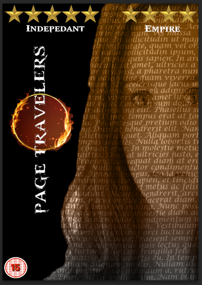
The
first idea which I kept was the idea of the text poster, even thought
this was the main idea on both the drawn design and in the trial
designs. I kept this idea, even though I did not experiment with other
ideas of creating a design was because the idea mainly. I liked the idea
of writing going across the face it makes it look modern but have a
really different effect given from it. I kept the image of this design
even though someone stated in the opinions part that they could not see
the writing on her hair, because it was the best image I could find for
what I wanted. Also going back to not being able to read the writing on
her hair. The idea was no that they were meant to read the writing on
the hair but to recognize the fact it it text, but also the effect it
gives when used in a different way.
The
second idea I kept was the idea of the colour gradient used on the text
image. However, I have dramatically changed the colour scheme from the
trials. I changed the colour to different shades of beige/brown. This
gave off a better vibe then both the green and black and white. It made
the image look more natural but also come in with a comment someone
made, by making the colour tonnes the same as paper. I felt this
judgement was a good idea because it really works it makes the image
have a nice mellow effect, and I also liked the concept of the idea.
The
third idea I kept was the ring of fire I trialed it once and someone
did state that they thought the purple did not work very well. I thought
it did, but I agree in the sense that it didn't work very well with the
green. I kept this idea in mind but changed the colour of the ring in
the final design to match the colour gradient of the girl. This was
because the gradient used in the final piece were very neutral colours
and I didn't think that the purple would look so well with it. Overall,
I liked the image I used for the ring of fire as it really brings out
both the background and the title.
The
fourth idea I kept from the original and the trial designs was the
faded writing. I think this worked really well on the black background.
Mainly because you can see where the lettering has been erased to look
like it has been faded. But also the white looks really effective on the
black, obviously because it is a brighter colour and it stands out. But
even on top if the ring of fire image; it works a lot better on the
final design than it did on trial one. I think this is because the
writing looked like it was blending in with the purple ring rather than
bringing it out. Whereas here, you can see it clearly because the white
colour balances it out with the more suttle tones of orange, red and
yellow.
The
fifth and final idea I kept was the black background. I kept this idea
because it looks and works a lot better than it did on the paper
background. It really brought out the text poster effect than it did on
the paper one. It also makes the colour gradient stand out because it is
such a dark background making it contrast with the colours. Not only
does it bring out the colours it also brings out all the features of the
design a lot better that without blending you can see the design. It
also makes the design look quite minimalist which I quite like as it does not look like it has been overpowered like most DVD covers can be, making it easy on the eyes.
Overall Evaluation
Overall
I think this design has come out really well considering the design was
drawn up on paper originally. I did have some doubts about this design,
mainly if it would work with the idea I had for the film. This was
because I was trying to go for a modern effect and more sophisticated
way of showing the film rather than everything that is related to the
idea itself. However, I think it turned out better than I anticipated. I
don't really know what it is but I really like the design and I think
it works. I think there needs to be a few tweaks here and there to make
it stand out more. I
think it is how little there is makes all the difference as it is easy
on the eyes, but it also goes above and beyond the expectation of the
assignment as well.
Final Design
Website References:
- Text Portrait Poster [Online] Available at: <
https://www.youtube.com/watch?v=pBGXksqYzeQ - Text Poster> [Accessed on 12th March 2014]
- God of War Font [Online] Available at: <
www.dafont.com/godofwar.font> [Accessed 12th March 2014]
Image References:
- Image of a Girl [Online
Image] Available at:
<http://michaelroud.com/wp-content/uploads/2013/04/Michael-Roud-Photography-Headshots-018-e1366697344852.jpg>
[Accessed on 12th March 2014]
- Ring of fire [Online Image] Available at: <http://www.canstockphoto.com/images-photos/ring-of-fire.html#file_view.php?id=4614241> [Accessed on 12th March 2014]
- Star [Online
Image] Available at:
<www.getthelabelblog.co.uk/wp-content/uploads/2013/oi/gold-star.jpg>
[Accessed on 12th March 2014]
Final Design
 |
| Final Design |
Ideas that I kept from trial designs
The first idea which I kept was the idea of the text poster, even thought this was the main idea on both the drawn design and in the trial designs. I kept this idea, even though I did not experiment with other ideas of creating a design was because the idea mainly. I liked the idea of writing going across the face it makes it look modern but have a really different effect given from it. I kept the image of this design even though someone stated in the opinions part that they could not see the writing on her hair, because it was the best image I could find for what I wanted. Also going back to not being able to read the writing on her hair. The idea was no that they were meant to read the writing on the hair but to recognize the fact it it text, but also the effect it gives when used in a different way.
The second idea I kept was the idea of the colour gradient used on the text image. However, I have dramatically changed the colour scheme from the trials. I changed the colour to different shades of beige/brown. This gave off a better vibe then both the green and black and white. It made the image look more natural but also come in with a comment someone made, by making the colour tonnes the same as paper. I felt this judgement was a good idea because it really works it makes the image have a nice mellow effect, and I also liked the concept of the idea.
The third idea I kept was the ring of fire I trialed it once and someone did state that they thought the purple did not work very well. I thought it did, but I agree in the sense that it didn't work very well with the green. I kept this idea in mind but changed the colour of the ring in the final design to match the colour gradient of the girl. This was because the gradient used in the final piece were very neutral colours and I didn't think that the purple would look so well with it. Overall, I liked the image I used for the ring of fire as it really brings out both the background and the title.
The
fourth idea I kept from the original and the trial designs was the
faded writing. I think this worked really well on the black background.
Mainly because you can see where the lettering has been erased to look
like it has been faded. But also the white looks really effective on the
black, obviously because it is a brighter colour and it stands out. But
even on top if the ring of fire image; it works a lot better on the
final design than it did on trial one. I think this is because the
writing looked like it was blending in with the purple ring rather than
bringing it out. Whereas here, you can see it clearly because the white
colour balances it out with the more suttle tones of orange, red and
yellow.
The
fifth and final idea I kept was the black background. I kept this idea
because it looks and works a lot better than it did on the paper
background. It really brought out the text poster effect than it did on
the paper one. It also makes the colour gradient stand out because it is
such a dark background making it contrast with the colours. Not only
does it bring out the colours it also brings out all the features of the
design a lot better that without blending you can see the design. It
also makes the design look quite minimalist which I quite like as it does not look like it has been overpowered like most DVD covers can be, making it easy on the eyes.
Overall Evaluation
Overall I think this design has come out really well considering the design was drawn up on paper originally. I did have some doubts about this design, mainly if it would work with the idea I had for the film. This was because I was trying to go for a modern effect and more sophisticated way of showing the film rather than everything that is related to the idea itself. However, I think it turned out better than I anticipated. I don't really know what it is but I really like the design and I think it works. I think there needs to be a few tweaks here and there to make it stand out more. I think it is how little there is makes all the difference as it is easy on the eyes, but it also goes above and beyond the expectation of the assignment as well.
Overall I think this design has come out really well considering the design was drawn up on paper originally. I did have some doubts about this design, mainly if it would work with the idea I had for the film. This was because I was trying to go for a modern effect and more sophisticated way of showing the film rather than everything that is related to the idea itself. However, I think it turned out better than I anticipated. I don't really know what it is but I really like the design and I think it works. I think there needs to be a few tweaks here and there to make it stand out more. I think it is how little there is makes all the difference as it is easy on the eyes, but it also goes above and beyond the expectation of the assignment as well.
Final Design
Website References:
- Text Portrait Poster [Online] Available at: <
https://www.youtube.com/watch?v=pBGXksqYzeQ - Text Poster> [Accessed on 12th March 2014] - God of War Font [Online] Available at: <
www.dafont.com/godofwar.font> [Accessed 12th March 2014]
Image References:
- Image of a Girl [Online Image] Available at: <http://michaelroud.com/wp-content/uploads/2013/04/Michael-Roud-Photography-Headshots-018-e1366697344852.jpg> [Accessed on 12th March 2014]
- Ring of fire [Online Image] Available at: <http://www.canstockphoto.com/images-photos/ring-of-fire.html#file_view.php?id=4614241> [Accessed on 12th March 2014]
- Star [Online Image] Available at: <www.getthelabelblog.co.uk/wp-content/uploads/2013/oi/gold-star.jpg> [Accessed on 12th March 2014]
Monday, 24 March 2014
Back Panel Design Final!
I
decided and stated within the Back Panel Design Trial! post, that I
will be recreating my back panel design from scratch. As I stated in the
previous post I will be changing the design because I felt that the
design I drew and created did not work very will with both the theme and
the effects that I was going to be using for both designs. I decided
this time not to draw my idea, this was mainly because it was an idea
that was on a whim, and if it went wrong or nothing worked then I would
have to keep redrawing all my ideas till the perfect one came along. So
instead I will describe what the design will look like.
Back Panel Design
My
new design consists of a lot of different pieces of paper on top one of
another. Firstly there will be one large picture of a piece of paper
this will be the base of the design. This will act almost like a letter
because there will be piece of paper attached on top with an image which
will look like a drawing. I will also be adding a few ink splodges to the main paper to give an extra little effect.
There
will be several pieces of paper that will look like that they are
attached to the bigger piece of paper with a paper clip. There will be
three in total, the bottom one will be made really dark, the second will
made lighter, and the top one will be the lighter of the three. I
decided to do this this way because one) it will define each of the
paper layers and two) it makes the image look aged. On the top layer of
the three stacked piece of paper there will be a image which I will
hopefully be able to make look like a drawing on the piece of paper of
the main character. Also there will be a paper clip attached, this will
then make it look like all the three piece of paper are kept together in
a pile. However, I also wanted the pieces of paper too look like they
are attached to the base paper.
I
have also decided to have two pieces of paper with images that also
look like drawings. They will just be placed on top of the main piece of
paper at angles which will make it more interesting. These will also
act as the screenshots of the movie as these
I
will also be adding a better language bar than the one I used
previously and also all the required logos that are used on a DVD inlay
case.
Self-Taught Tutorials - Experimentation for Design
I
have looked up a tutorial before I begin my design process this is
because it then will allow me to see what I like and what I don't like
about the tutorial I am going to be using and how I will implement it
into my design. By doing this I will recreate the tutorial, this will
give me an idea of: one) what the effects look like and two) how well it
will work with the other layers.
The step by step guide can be found at : http://www.photoshoproadmap.com/Photoshop-blog/portrait-to-color-sketch-tutorial/
I
only did the one tutorial because one) it was the only one I found and
two) it had turned out exactly as I wanted. The tutorial was based on
turning an image into a colour sketch. This tutorial was very simple to
follow making it easy to reproduce. I recreated the tutorial and it went
well.
What
I like about the recreation is how well it has actually come out. It
looked really effective for what I want to do within the design. It
shows lots of detail which is what I wanted and also what more sketches
have. This detail is important because the images which I will be using
will be screenshots for the film.
It
looks very realistic as well. This is again due to the detail, but also
the strokes on the image. This makes it more believable almost like the
image has been scanned onto a computer. I also like the faded colours,
reminds me of water colours but also makes the image look like the
colours have been faded overtime, which I really liked the look of.
Final Design

Final Back panel design on a design background.
Here
is the final over all design of my back panel, it is on a back panel of
one of the final final designs. I did it this way because unlike before
where it was on a transparent background, you can see better what works
and what would not. Also it was easier then just imagining the
background there, I also knew that what would work one background it
would work on another.
Overall,
I really adore this design! I am very happy I changed the design when I
did as I would have stuck with a design which I did not like and felt
would bring the whole design down. I feel that the improvement will make
each of the inlays more professional because I used other techniques
which helped the idea blend in more and look more attractive and
interesting.
What I
like about the design is how it all compliments each other. For
example, the layered peice of paper works with the background paper, the
colours compliment each other. It also compliments the theme of the
overall design I wanted and I think it will go with both the designs I
have trialed. I know in the second design I tried to go for something
modern, however I feel the colours will really contrast well with this
design, especially on the dark background; which will bring the design
out.
I
like how the levels have worked really well on the design creating the
different tones which made the pieces of paper look like they are faded
or almost burned. I also liked the idea of making them at different
levels to show the different layers. I also like the images that I have
chosen for the design. They all compliment each other really well and
work well within the design. I also like how I tried to make the main
paper image look more realistic by giving it a bit of a curve almost
like the edge of the paper is about bend.
I
also like the idea of blending the images into the paper. This makes
them look more worn and faded, but also makes them look like that they
have been drawn on the pieces of paper. I also think that this looks
more effect than having them on the film reel and the book mark which I
had last time, even though I liked the idea.
Back Panel
Website References:
- Image to Colour Sketch Tutorial [Online] Available at:<http://www.photoshoproadmap.com/Photoshop-blog/portrait-to-color-sketch-tutorial/> [Accessed on 11th March 2014]
Image References:
- Lara using Bow [Online
Image] Available at:
<http://www.hdwallpapers.in/walls/2013_lara_croft_tomb_raider-wide.jpg>
[Accessed on 11th March 2014]
- Lara Sitting on Bed [Online
Image] Available at:
<https://blogger.googleusercontent.com/img/b/R29vZ2xl/AVvXsEiLAy2wZOC4obgUsuNgysJxtBP83amumEU4fTBJJSQwYPkSHBhRWh0Sv6Hui_rAwRCethQoXVQCUMRp2yG9msIv02YO9GvGChDHrQsX9w_WKkL-6NuBg0dl2p_k_cpZiTe-jN5gFqRG3Xs/s1600/New-Tomb-Raider-2012-lara-croft-character-design.jpg>
[Accessed on 11th March 2014]
- Lara - Full Body [Online Image] Available at: <> [Accessed on 11th March 2014]
- Old paper texture [Online
Image] Available at:
<http://fc00.deviantart.net/fs71/i/2011/108/5/3/old_paper_texture_2_by_i__zoldalma__i-d3e9scu.png>
[Accessed on 11th March 2014]
- Old Torn paper Texture [Online
Image] Available at <
http://www.marcmoody.com/CONTACT_files/GREAT%20BROKEN%20PARCHMENT.png>
[Accessed on 11th March 2014]
- Languages -
- Barcode [Online
Image] Available at:
<http://www.themobilists.com/wp-content/uploads/2011/06/sample-1d-barcode1.jpg>
[Accessed on 11th March 2014]
Tuesday, 25 March 2014
I
decided and stated within the Back Panel Design Trial! post, that I
will be recreating my back panel design from scratch. As I stated in the
previous post I will be changing the design because I felt that the
design I drew and created did not work very will with both the theme and
the effects that I was going to be using for both designs. I decided
this time not to draw my idea, this was mainly because it was an idea
that was on a whim, and if it went wrong or nothing worked then I would
have to keep redrawing all my ideas till the perfect one came along. So
instead I will describe what the design will look like.
My new design consists of a lot of different pieces of paper on top one of another. Firstly there will be one large picture of a piece of paper this will be the base of the design. This will act almost like a letter because there will be piece of paper attached on top with an image which will look like a drawing. I will also be adding a few ink splodges to the main paper to give an extra little effect.
There will be several pieces of paper that will look like that they are attached to the bigger piece of paper with a paper clip. There will be three in total, the bottom one will be made really dark, the second will made lighter, and the top one will be the lighter of the three. I decided to do this this way because one) it will define each of the paper layers and two) it makes the image look aged. On the top layer of the three stacked piece of paper there will be a image which I will hopefully be able to make look like a drawing on the piece of paper of the main character. Also there will be a paper clip attached, this will then make it look like all the three piece of paper are kept together in a pile. However, I also wanted the pieces of paper too look like they are attached to the base paper.
I have also decided to have two pieces of paper with images that also look like drawings. They will just be placed on top of the main piece of paper at angles which will make it more interesting. These will also act as the screenshots of the movie as these
I will also be adding a better language bar than the one I used previously and also all the required logos that are used on a DVD inlay case.
Here is the final over all design of my back panel, it is on a back panel of one of the final final designs. I did it this way because unlike before where it was on a transparent background, you can see better what works and what would not. Also it was easier then just imagining the background there, I also knew that what would work one background it would work on another.
Overall, I really adore this design! I am very happy I changed the design when I did as I would have stuck with a design which I did not like and felt would bring the whole design down. I feel that the improvement will make each of the inlays more professional because I used other techniques which helped the idea blend in more and look more attractive and interesting.
Back Panel
Back Panel Design
My new design consists of a lot of different pieces of paper on top one of another. Firstly there will be one large picture of a piece of paper this will be the base of the design. This will act almost like a letter because there will be piece of paper attached on top with an image which will look like a drawing. I will also be adding a few ink splodges to the main paper to give an extra little effect.
There will be several pieces of paper that will look like that they are attached to the bigger piece of paper with a paper clip. There will be three in total, the bottom one will be made really dark, the second will made lighter, and the top one will be the lighter of the three. I decided to do this this way because one) it will define each of the paper layers and two) it makes the image look aged. On the top layer of the three stacked piece of paper there will be a image which I will hopefully be able to make look like a drawing on the piece of paper of the main character. Also there will be a paper clip attached, this will then make it look like all the three piece of paper are kept together in a pile. However, I also wanted the pieces of paper too look like they are attached to the base paper.
I have also decided to have two pieces of paper with images that also look like drawings. They will just be placed on top of the main piece of paper at angles which will make it more interesting. These will also act as the screenshots of the movie as these
I will also be adding a better language bar than the one I used previously and also all the required logos that are used on a DVD inlay case.
Self-Taught Tutorials - Experimentation for Design
I
have looked up a tutorial before I begin my design process this is
because it then will allow me to see what I like and what I don't like
about the tutorial I am going to be using and how I will implement it
into my design. By doing this I will recreate the tutorial, this will
give me an idea of: one) what the effects look like and two) how well it
will work with the other layers.
The step by step guide can be found at : http://www.photoshoproadmap.com/Photoshop-blog/portrait-to-color-sketch-tutorial/
I
only did the one tutorial because one) it was the only one I found and
two) it had turned out exactly as I wanted. The tutorial was based on
turning an image into a colour sketch. This tutorial was very simple to
follow making it easy to reproduce. I recreated the tutorial and it went
well.
What I like about the recreation is how well it has actually come out. It looked really effective for what I want to do within the design. It shows lots of detail which is what I wanted and also what more sketches have. This detail is important because the images which I will be using will be screenshots for the film.
It looks very realistic as well. This is again due to the detail, but also the strokes on the image. This makes it more believable almost like the image has been scanned onto a computer. I also like the faded colours, reminds me of water colours but also makes the image look like the colours have been faded overtime, which I really liked the look of.
Final Design
 | ||
| Final Back panel design on a design background. |
Here is the final over all design of my back panel, it is on a back panel of one of the final final designs. I did it this way because unlike before where it was on a transparent background, you can see better what works and what would not. Also it was easier then just imagining the background there, I also knew that what would work one background it would work on another.
Overall, I really adore this design! I am very happy I changed the design when I did as I would have stuck with a design which I did not like and felt would bring the whole design down. I feel that the improvement will make each of the inlays more professional because I used other techniques which helped the idea blend in more and look more attractive and interesting.
What I
like about the design is how it all compliments each other. For
example, the layered peice of paper works with the background paper, the
colours compliment each other. It also compliments the theme of the
overall design I wanted and I think it will go with both the designs I
have trialed. I know in the second design I tried to go for something
modern, however I feel the colours will really contrast well with this
design, especially on the dark background; which will bring the design
out.
I
like how the levels have worked really well on the design creating the
different tones which made the pieces of paper look like they are faded
or almost burned. I also liked the idea of making them at different
levels to show the different layers. I also like the images that I have
chosen for the design. They all compliment each other really well and
work well within the design. I also like how I tried to make the main
paper image look more realistic by giving it a bit of a curve almost
like the edge of the paper is about bend.
I also like the idea of blending the images into the paper. This makes them look more worn and faded, but also makes them look like that they have been drawn on the pieces of paper. I also think that this looks more effect than having them on the film reel and the book mark which I had last time, even though I liked the idea.
I also like the idea of blending the images into the paper. This makes them look more worn and faded, but also makes them look like that they have been drawn on the pieces of paper. I also think that this looks more effect than having them on the film reel and the book mark which I had last time, even though I liked the idea.
Back Panel
Website References:
- Image to Colour Sketch Tutorial [Online] Available at:<http://www.photoshoproadmap.com/Photoshop-blog/portrait-to-color-sketch-tutorial/> [Accessed on 11th March 2014]
- Lara using Bow [Online Image] Available at: <http://www.hdwallpapers.in/walls/2013_lara_croft_tomb_raider-wide.jpg> [Accessed on 11th March 2014]
- Lara Sitting on Bed [Online Image] Available at: <https://blogger.googleusercontent.com/img/b/R29vZ2xl/AVvXsEiLAy2wZOC4obgUsuNgysJxtBP83amumEU4fTBJJSQwYPkSHBhRWh0Sv6Hui_rAwRCethQoXVQCUMRp2yG9msIv02YO9GvGChDHrQsX9w_WKkL-6NuBg0dl2p_k_cpZiTe-jN5gFqRG3Xs/s1600/New-Tomb-Raider-2012-lara-croft-character-design.jpg> [Accessed on 11th March 2014]
- Lara - Full Body [Online Image] Available at: <> [Accessed on 11th March 2014]
- Old paper texture [Online Image] Available at: <http://fc00.deviantart.net/fs71/i/2011/108/5/3/old_paper_texture_2_by_i__zoldalma__i-d3e9scu.png> [Accessed on 11th March 2014]
- Old Torn paper Texture [Online Image] Available at < http://www.marcmoody.com/CONTACT_files/GREAT%20BROKEN%20PARCHMENT.png> [Accessed on 11th March 2014]
- Languages -
- Barcode [Online Image] Available at: <http://www.themobilists.com/wp-content/uploads/2011/06/sample-1d-barcode1.jpg> [Accessed on 11th March 2014]
Tuesday, 25 March 2014
DVD Inlay Final Pieces! [Front Cover, Spine & Back Panel
In
this post there will be both designs which I have originally drawn out
on paper. Each one has been through trial processes to see what worked
and what did not through the original design and other ideas and plans
for the design. I then took piece of each of the trials designs I asked
for other peoples opinions on the designs to see what appealed to them
and what did not. This then allowed me to created the final design
picking out what I liked and other ideas which worked but needed
tweaking to make it look more effective and appealing.
After
this process I then finally brought all these ideas together and
created my final final pieces on the the actual DVD inlay itself. The
front panel, the back panel and the spine. I will now be stating which
one I will be making as my final design and why, based on the process of
the design, the actual design itself and how well it fits within the
original idea I had for the film.
Picking the Final Design
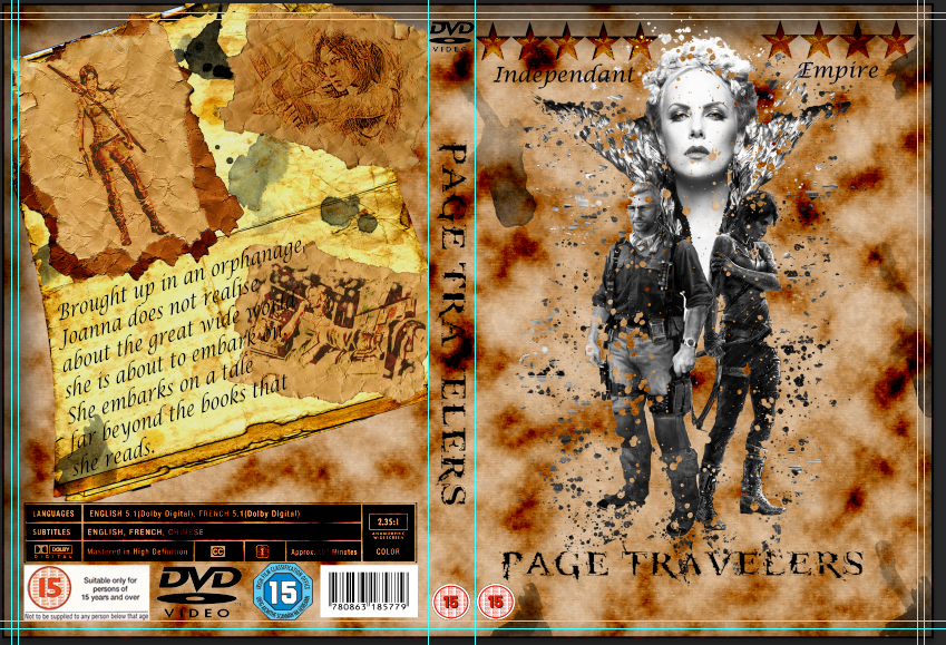
Final Design for Design Idea 1
Overall each of these designs were easy to create (thanks to the tutorials). But on the whole the design I have picked for my final piece was Design Idea 1!
Design Idea
The
first design really caught my attention and really excited me when I
first thought and drew out the design. This was because mainly because
of the challenge that came with the idea of making an image(s) look like
the are dissolving to con inside with the concept of the idea I
originally had with the piece.
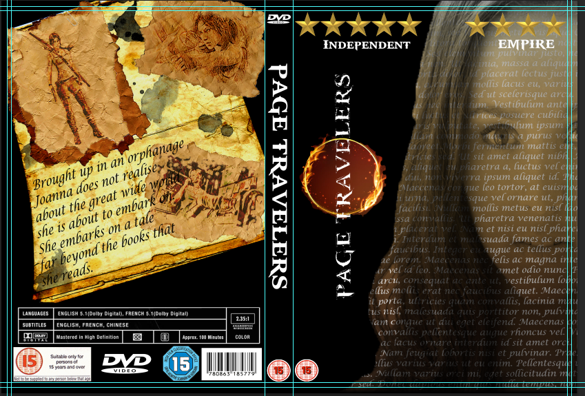
Final Design for Design Idea 2
I
do like the idea of the second design it did work really well it made
the design look more modern and it was different to the effects I have
seen on current DVD inlays. However, I felt that it does not give off
that same sort of drawn in effect as the first design does. The
first design makes you feel that something big is going to be happening
where as the second design does not have that appeal in my opinion.
Design Process (Trials and Creating the Design)
The
trials for the first design I felt were more successful than the trials
for the second design as well, especially when it came to the front
cover. There was lots of positive feed back from the first trial, a few
more than the second one, which also made the difference.
The
first design trials came together really well and lots of different
elements were incorporated within the final design from each, such as
the three images from the third trial, the blended ratings from trial 1
etc. Also it showed me where I needed to improve on for this final
design.
The
process of creating this whole design was really easy and simple since I
did the tutorials. However, overall bringing it all together the
elements was really easy, as well as the creation of each of the
sections. This really fits within the second design because it was
really simple as said to put together. But with the first design it was
was more challenging for me because of all the complex effective
features which got me confused at times, however, I did get through it
and the results came out really well.
How the design fits in with the theme of the idea
The
first design fits in with the theme of the idea that I wanted. The main
idea for the film was that the main character was to travel through the
book. So the main idea that came into mind was items that are related
to books. So items such as paper, book covers, text, ink, old, worn,
faded and pictures etc. This where the first design really fits in to
these aspects.
First
of all the paper background makes it look different, the paper looks
like it has a burned look to it. This makes the paper look old and
faded, which is perfect for the images I will use. The images really fit
in the concept of what I wanted for the design. I wanted it to look
like an splash of ink, which I felt that the final piece really caught
the concept. The main images look like a massive splash of ink and the
little splashes of the images along with it when the ink splashes. It
makes the cover look really old and withered which was the kind of
effect that I wanted in the first place.
The
second design does not really fit within the idea of faded, worn and
old. But took a more modern version of the cover. It uses the text side
of relation to the book. It took the text and put it into a different
context, however, I don't feel that it really give that appeal or that
effect that the first design gives. It does not really draw me in like
the first design does. I am not sure what it is, maybe it is because it
does not really relate as well as the first design to the overall them
of the film.
The
back cover for both designs both that it within all of the themes. The
background works with the paper background as well as the dark
background. The paper background makes all the other piece of paper look
like that they are all on top of each other in a pile. I have to admit
the black background really brought out the back panel design, made it
stand out more.
The
actual design of the back panel really fitted well with the overall
idea of the film. I think that the images that look like the sketches
which are faded and look really worn works really well with the theme.
It makes it look like old torn images from a book which made the
screenshots be really brought out by blend in with the theme at the same
time which is what I really wanted from the back panel design.
I will now be posted step by steps of how I created the final design.
In
this post there will be both designs which I have originally drawn out
on paper. Each one has been through trial processes to see what worked
and what did not through the original design and other ideas and plans
for the design. I then took piece of each of the trials designs I asked
for other peoples opinions on the designs to see what appealed to them
and what did not. This then allowed me to created the final design
picking out what I liked and other ideas which worked but needed
tweaking to make it look more effective and appealing.
After
this process I then finally brought all these ideas together and
created my final final pieces on the the actual DVD inlay itself. The
front panel, the back panel and the spine. I will now be stating which
one I will be making as my final design and why, based on the process of
the design, the actual design itself and how well it fits within the
original idea I had for the film.
Picking the Final Design
 |
| Final Design for Design Idea 1 |
Overall each of these designs were easy to create (thanks to the tutorials). But on the whole the design I have picked for my final piece was Design Idea 1!
Design Idea
The
first design really caught my attention and really excited me when I
first thought and drew out the design. This was because mainly because
of the challenge that came with the idea of making an image(s) look like
the are dissolving to con inside with the concept of the idea I
originally had with the piece.
 |
| Final Design for Design Idea 2 |
I
do like the idea of the second design it did work really well it made
the design look more modern and it was different to the effects I have
seen on current DVD inlays. However, I felt that it does not give off
that same sort of drawn in effect as the first design does. The
first design makes you feel that something big is going to be happening
where as the second design does not have that appeal in my opinion.
Design Process (Trials and Creating the Design)
The
trials for the first design I felt were more successful than the trials
for the second design as well, especially when it came to the front
cover. There was lots of positive feed back from the first trial, a few
more than the second one, which also made the difference.
The first design trials came together really well and lots of different elements were incorporated within the final design from each, such as the three images from the third trial, the blended ratings from trial 1 etc. Also it showed me where I needed to improve on for this final design.
The process of creating this whole design was really easy and simple since I did the tutorials. However, overall bringing it all together the elements was really easy, as well as the creation of each of the sections. This really fits within the second design because it was really simple as said to put together. But with the first design it was was more challenging for me because of all the complex effective features which got me confused at times, however, I did get through it and the results came out really well.
How the design fits in with the theme of the idea
The first design fits in with the theme of the idea that I wanted. The main idea for the film was that the main character was to travel through the book. So the main idea that came into mind was items that are related to books. So items such as paper, book covers, text, ink, old, worn, faded and pictures etc. This where the first design really fits in to these aspects.
First of all the paper background makes it look different, the paper looks like it has a burned look to it. This makes the paper look old and faded, which is perfect for the images I will use. The images really fit in the concept of what I wanted for the design. I wanted it to look like an splash of ink, which I felt that the final piece really caught the concept. The main images look like a massive splash of ink and the little splashes of the images along with it when the ink splashes. It makes the cover look really old and withered which was the kind of effect that I wanted in the first place.
The second design does not really fit within the idea of faded, worn and old. But took a more modern version of the cover. It uses the text side of relation to the book. It took the text and put it into a different context, however, I don't feel that it really give that appeal or that effect that the first design gives. It does not really draw me in like the first design does. I am not sure what it is, maybe it is because it does not really relate as well as the first design to the overall them of the film.
The back cover for both designs both that it within all of the themes. The background works with the paper background as well as the dark background. The paper background makes all the other piece of paper look like that they are all on top of each other in a pile. I have to admit the black background really brought out the back panel design, made it stand out more.
The actual design of the back panel really fitted well with the overall idea of the film. I think that the images that look like the sketches which are faded and look really worn works really well with the theme. It makes it look like old torn images from a book which made the screenshots be really brought out by blend in with the theme at the same time which is what I really wanted from the back panel design.
I will now be posted step by steps of how I created the final design.
DVD Inlay Cover [DVD Background] Step by Step - Old Paper Effect
Old Paper Effect
Here are the tools/effects that I will be using within this part of the design:
- Rectangle Tool
- Bucket Tool
- Smart Object
- Noise
- Filter Gallery
- Clipping Mask
- Clouds
- Blending Mode
- Inner Shadow
First of all I will create the old paper background for the DVD Inlay. To start the design I will use the Rectangle Tool. To select the tool I clicked on the rectangle icon and selected the Rectangle Tool.
Rectangle Tool
To fill the rectangle in I selected the Paint Bucket Tool. To select this I right clicked on the gradient tool and then selected the Paint Bucket Tool. I then clicked on the rectangle and it filled with the newly selected beige colour.
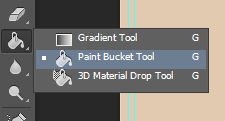
Paint Bucket Tool
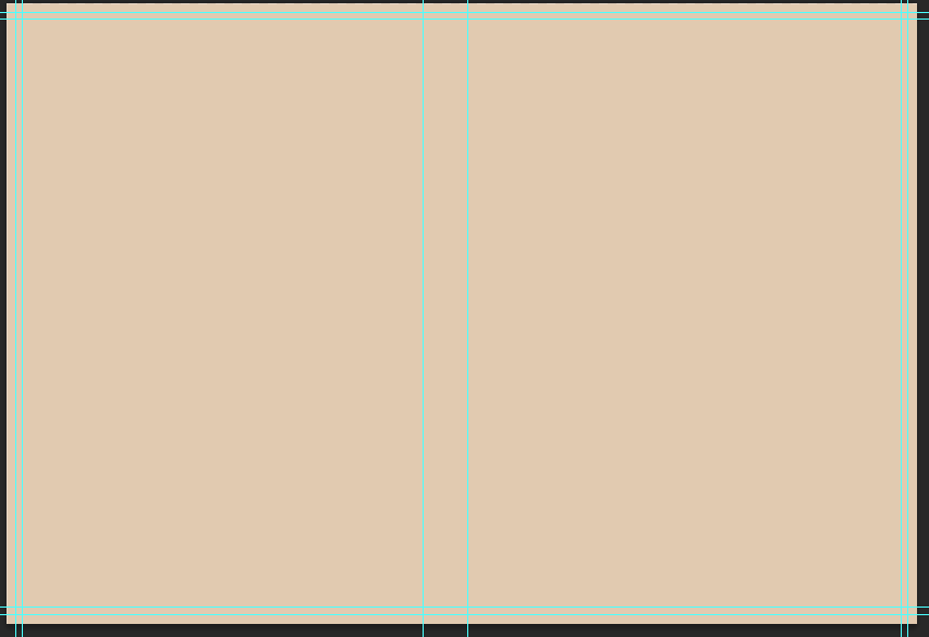
Rectangle Filled with the hex code #e1cab0
I will now need to convert the layer into a Smart Object. I did this because it will enable me to edit the filters at any point. To do this I clicked Edit > Convert to Smart Object. A menu will appear and then I clicked OK. A little item will appear on the layer to state it has been converted to a Smart Object.
Layer Converted into Smart Object
Next
I added some noise to the background. This gives a little speckling
effect to the colour, make it a bit more realistic. To create the noise
you go to Filter > Noise > Add Noise. This
will open the menu and I will have changed the noise settings to 3.5%
as it will give it a little freckling but not enough that it will make
the final design look unrealistic.
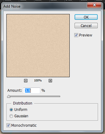
Noise Menu set at 3.5%
I
will now add a filter gallery effect to the layer. This will make the
paper look even more realistic by making it look like you can touch and
feel it. I will be applying theUnderpainting Filter. To do this I will need to go to Filter > Filter Gallery > Artistic > Underpainting > OK. So the design will look like this at this point.

Filter Gallery in Place on Design
I need to create a new layer. To do this I clicked on the New Layer button
which looks like a little post it note in the bottom right corner of
the layers panel. The new layer will then display within the layer
panel.
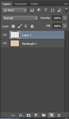
New Layer
When the layer is created I will add a Clipping Mask to the current paper layer. To do this I help down the Alt button
and holding the cursor over the line between the layers and then
clicked it. The new layer will now display a down arrow sign displayed
next to the layer.
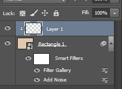
Clipping Mask In place
In the new layer I will be creating a cloud effect. First off all I clicked the D button on the keyboard and this switched the colour panel back to default. To create the Clouds I clickedFilter > Render > Clouds. The clouds will be produced and created onto the layer.
I will be blending the cloud effect with the paper layer. To do this I double clicked on the cloud layer and it will open the Blending Menu. I will then set the blending mode fromNormal > Colour Burn. This will then burn the clouds through the paper layer creating a burning effect.
I
will not be changing any of the other settings within the panel because
I like the way in which the effects work with each other already. It
makes the paper look old and worn which was the effect I am after. Here is what the document looks like so far.
I will now add a little Inner Shadow to
the edges of the design to make it look a little darker around the
edges, which will make the edges look like they have darkened over time.
I did not change the blend mode, however I did change the opacity to
44% because I did not want the edges to be blocked out with a black
boarder.
I also changed the Choke to
the fullest setting. The choke represents the thickness of the inner
shadow, so the bigger the percentage the thicker it will be. I also
changed the Size to 44 which was enough that the edges were
covered with an effect, but also enough that it did not over power the
edges of the paper effect itself.
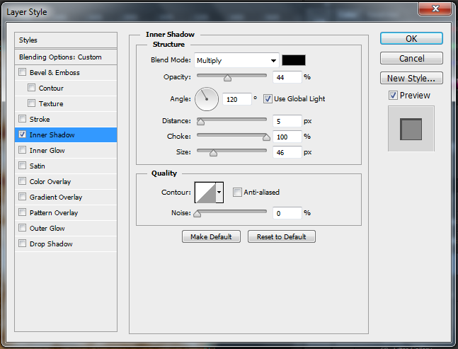
Inner Shadow Settings
Here is what the finished DVD Background will look like.
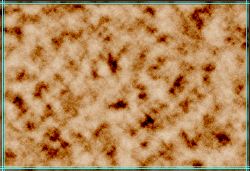
Finished results of the DVD Background
Old Paper Effect
Here are the tools/effects that I will be using within this part of the design:
- Rectangle Tool
- Bucket Tool
- Smart Object
- Noise
- Filter Gallery
- Clipping Mask
- Clouds
- Blending Mode
- Inner Shadow
 |
| Rectangle Tool |
To fill the rectangle in I selected the Paint Bucket Tool. To select this I right clicked on the gradient tool and then selected the Paint Bucket Tool. I then clicked on the rectangle and it filled with the newly selected beige colour.
|
 |
| Clipping Mask In place |
In the new layer I will be creating a cloud effect. First off all I clicked the D button on the keyboard and this switched the colour panel back to default. To create the Clouds I clickedFilter > Render > Clouds. The clouds will be produced and created onto the layer.
I will be blending the cloud effect with the paper layer. To do this I double clicked on the cloud layer and it will open the Blending Menu. I will then set the blending mode fromNormal > Colour Burn. This will then burn the clouds through the paper layer creating a burning effect.
I
will not be changing any of the other settings within the panel because
I like the way in which the effects work with each other already. It
makes the paper look old and worn which was the effect I am after. Here is what the document looks like so far.
I will now add a little Inner Shadow to
the edges of the design to make it look a little darker around the
edges, which will make the edges look like they have darkened over time.
I did not change the blend mode, however I did change the opacity to
44% because I did not want the edges to be blocked out with a black
boarder.
I also changed the Choke to
the fullest setting. The choke represents the thickness of the inner
shadow, so the bigger the percentage the thicker it will be. I also
changed the Size to 44 which was enough that the edges were
covered with an effect, but also enough that it did not over power the
edges of the paper effect itself.
 |
| Inner Shadow Settings |
Here is what the finished DVD Background will look like.
 |
| Finished results of the DVD Background |
DVD Inlay Cover [Front] Step by Step - Splatter/Dispersion Effect
Splatter/Dispersion Effect
Here are the tools/effects that I will be using within this part of the design:
- Rectangular Marquee Tool
- Quick Selection Tool
- Eraser
- Free Transform
- Black & White
- Lasso Tool
- Fill
- Liquify
- Layer Mask
- Splatter Brushes
Now I
have created the background for the DVD Inlay, I will start to create
the splatter effect of the main characters/images. Before I do this
effect I needed to sort out the original images on their canvas
before transferring them to the DVD inlay canvas; i.e making them have a
transparent background, so no background colour is seen on the Inlay.
First of all to start I will need to open all the images that I will be using, by clicking File > Open then
searching for the images. I noticed for the Lara image I did not need
to work it because it is already on a transparent background.
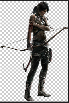
Lara image with a transparent background
Still on the image I then used the Rectangular Marquee Tool. To select this tool I clicked on the dashed rectangle icon.

Rectangular Marquee Tool
I then clicked on a corner and dragged the rectangle from corner to corner till the whole canvas is selected with dashed lines.
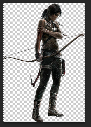
Lara image selected
I then pressed Ctrl + C. This has copied the image. I then change the panel in Photoshop back to the DVD Inlay and pasted by going to Edit > Paste Special > Paste In Place. The image will now be pasted onto the document on a new layer.
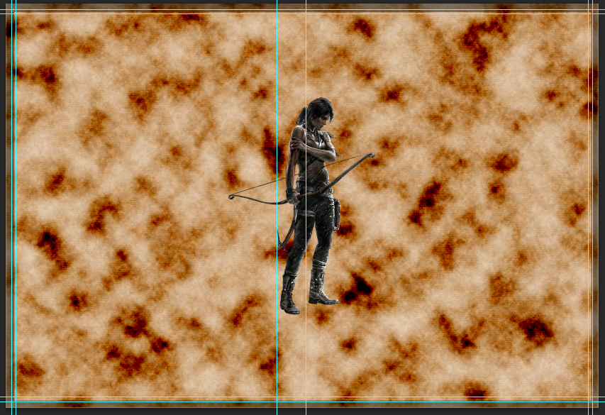
Lara image in the DVD inlay
For
the other two images (Conard Roth & The Witch), I will have to
separate them from their backgrounds. I did this by using the Quick Selection Tool. To select this tool I clicked on the little icon with the paint brush and a dashed oval.

Quick Selection Tool
I
choose to use the quick selection tool, mainly because (hence in the
name of the title) it was quicker then using some of the other selection
tools, such as the Magnetic Lasso tool or the Polygonal Lasso Tool.
This is because they need patients to be used which one quality I
shamefully do not possess, and also because they trace around the image
outline, very carefully. The Quick Selection Tool does this was well,
but at a much faster rate, however the only fault is sometimes you have
to use the eraser to erase some parts which were selected. But I don't
mind doing this as it would allow you to erase parts of the images you
would not want in the first place.
Back
to the image, I then selected parts of the image I wished to keep. Once
done it will display a dashed line around the image.
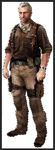
Conard image selected with the quick selection tool
I then right clicked on the image selected and selected Layer Via Cut. This
then cuts the image from the original background and placed it in a new
layer. I then hide the background layer so I was left with the image
and used the Eraser to erase some of the background which was left on the image.
I again used the Rectangular Marquee Tool to select the image canvas from corner to corner copied the image (Ctrl + C) and pasted it via Paste Special in the DVD inlay and should appear on a new layer.
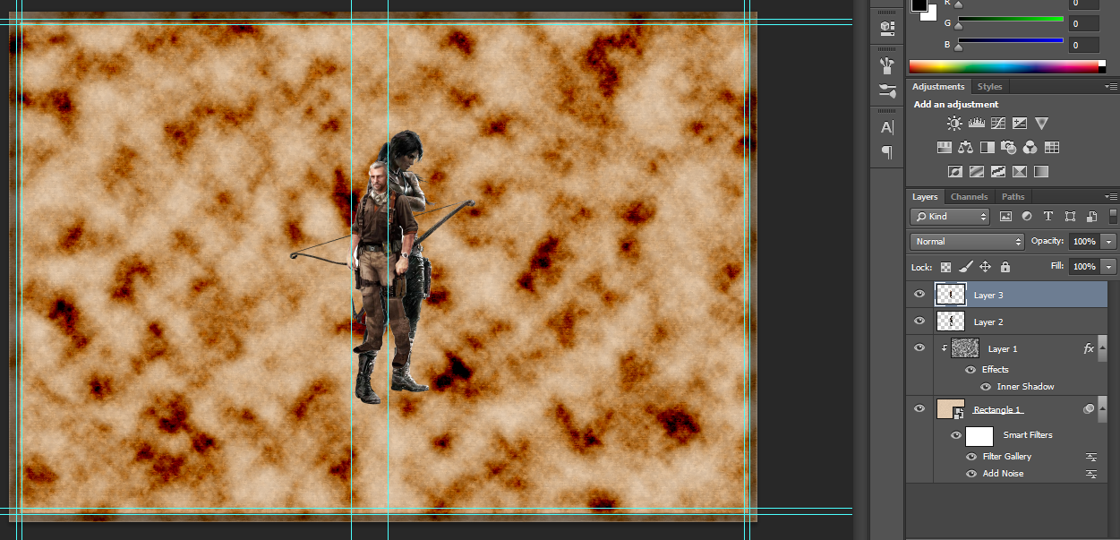
Conard image in the DVD inlay in a new layer
I
used the same steps as I did for the Conard Image for the The Witch
Image. However, this time I did not have to use the eraser. So now all
my images will be in my DVD Inlay and in their own layers.
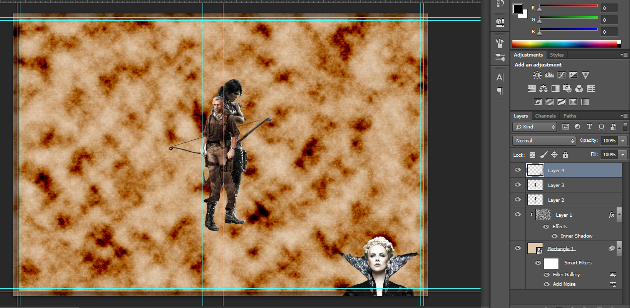
All the images on the DVD inlay
Now the images are in the DVD Inlay I moved and re-sized them. To do this I selected the image layer and went to Edit > Free Transform. The image will have a box around it allowing you to re-size the images and move it.
Witch image in free transform mode
I
did this for each image till I found a suitable size and have found
where I wanted each of the images to be. I made sure that the two
characters in front of the with image were quite close together, this
was so that it would hide the bottom part of the image. This is because
the bottom is a straight line and it would look tacky and unrealistic if
the line was left on show. Here is what it will look like.
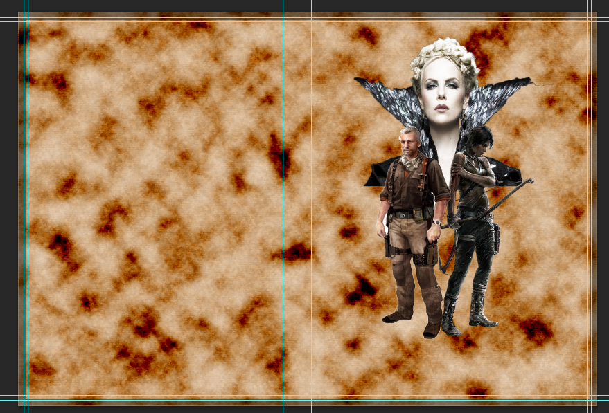
All the image in place
I
then did a little destructive editing to the Witch image. I used the
eraser for this mainly because it was a simple editing which did not
require such detail. I then erased the shoulders of the witch to the
point that it reached the outline of the images of the other characters.
I did this because the image looked did not look right with shape to
the shoulder and then a straight bottomed edge, also it does not blend
in very well.
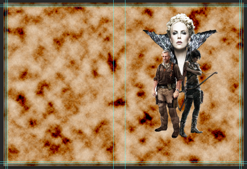
Witch image edited
I
was happy where the images were placed I decided to merge the layers
together into one. I did this because it would make the next steps
easier for me to complete than doing it individually on each layer. To
do this I right clicked on the top layer and selected Merge Down. I did this again till I only had the paper layer and the character layers left.

Merged layers
I now did some more destructive editing. I changed the images to Black & White. This
will allow me to have black and white tones in the images and will make
the effect more effective for what I want; in this case is an ink
effect and most standard inks are black. To make this effect I clicked
on Image > Adjustments > Black & White. Within
this menu it allows me to change the scale of colours to the tones that
I want for the images. Here is the scale of colours I choose.
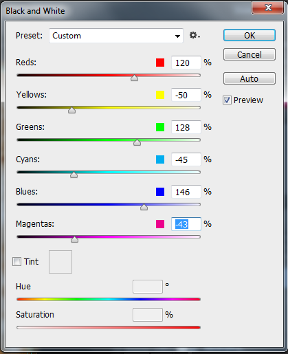
Black and White scale used on images
This is how the DVD Inlay should look so far.
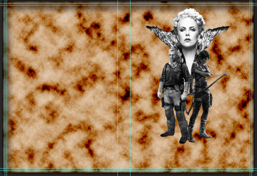
What the DVD inlay look like so far.
Now for the splatter effect. First of I merged the character layer and the paper layer byMerge Down. I then selected the layer and clicked Ctrl + J twice. This copied the layer twice. I then selected the middle of the three layers and clicked on the Lasso Tool icon. This icon looks like a little lasso.

Lasso Tool Icon
When I selected the tool I drew roughly around the shape of the characters and right clicked then Fill > Content - Aware > OK. This will fill where the characters were with the background.
Layer filled in
I then created two copies of the characters just one their own. To do this I selected the top layer and used the Quick Selection Tool to quickly select the images. Once selected I right clicked on the selected area and selected Layer Via Copy. I choose copy this time as I do not need it to be cut from the background. I then clicked on the new created layer and clicked Ctrl + J to copy the layer.
I
will now hide the top layer with both the images and the paper
background. Now to create the effect. To do this I started by selecting a
layer and going to Filter > Liquify.Liqify allows me to
deform an image. A menu will open and I began to deform the image, to do
this I clicked on part of the image and dragged it out. I kept doing
this till I was happy with the results.
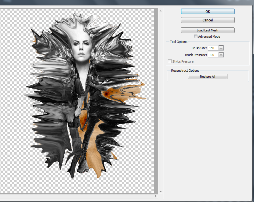
Images liquifed
I then added a Layer Mask to
the layer which I just liquefied. To do this I clicked on the icon
which looks like a rectangle with a circle in the middle. The layer mask
will then be displayed next to the selected layer.

Layer Mask Icon
I
filled this layer mask with black colour. I did the same procedure for
the other image layer by adding a layer mask and filling it in with
white this time.

Layer masks on the images
I
then selected the what layer mask with the normal images and then I
selected some splatter brushes. I changed the colour to black and then
started using the brush on the images themselves. This will give the
effect that part of the image has dissolved or been worn. I kept doing
this till I was happy with the results.
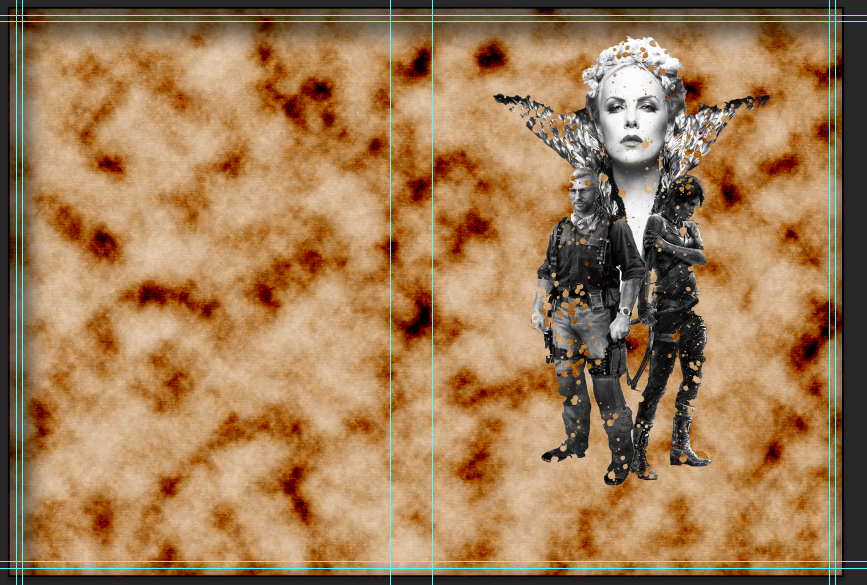
First part of the splatter effect. Images look like they are worn/dissolved
I
then selected the black layer mask with the liquefied image and then
again selected some splatter brushes. I changed the colour to white and
then started to use the brush mainly on the background, this should then
bring out some speckling from the liquefied image; hence creating the
splatter effect. I kept using the splatter brush set till I was happy
with the results.
Splatter/Dispersion Effect
Here are the tools/effects that I will be using within this part of the design:
First of all to start I will need to open all the images that I will be using, by clicking File > Open then searching for the images. I noticed for the Lara image I did not need to work it because it is already on a transparent background.
Still on the image I then used the Rectangular Marquee Tool. To select this tool I clicked on the dashed rectangle icon.
I then pressed Ctrl + C. This has copied the image. I then change the panel in Photoshop back to the DVD Inlay and pasted by going to Edit > Paste Special > Paste In Place. The image will now be pasted onto the document on a new layer.
- Rectangular Marquee Tool
- Quick Selection Tool
- Eraser
- Free Transform
- Black & White
- Lasso Tool
- Fill
- Liquify
- Layer Mask
- Splatter Brushes
First of all to start I will need to open all the images that I will be using, by clicking File > Open then searching for the images. I noticed for the Lara image I did not need to work it because it is already on a transparent background.
 |
| Lara image with a transparent background |
 |
| Rectangular Marquee Tool |
I then clicked on a corner and dragged the rectangle from corner to corner till the whole canvas is selected with dashed lines.
 |
| Lara image selected |
 |
| Lara image in the DVD inlay |
 |
| Quick Selection Tool |
Back to the image, I then selected parts of the image I wished to keep. Once done it will display a dashed line around the image.
 |
| Conard image selected with the quick selection tool |
I again used the Rectangular Marquee Tool to select the image canvas from corner to corner copied the image (Ctrl + C) and pasted it via Paste Special in the DVD inlay and should appear on a new layer.
 |
| Conard image in the DVD inlay in a new layer |
 |
| All the images on the DVD inlay |
 |
| Witch image in free transform mode |
 |
| All the image in place |
 |
| Witch image edited |
 |
| Merged layers |
 |
| Black and White scale used on images |
 |
| What the DVD inlay look like so far. |
 |
| Lasso Tool Icon |
 |
| Layer filled in |
I will now hide the top layer with both the images and the paper background. Now to create the effect. To do this I started by selecting a layer and going to Filter > Liquify.Liqify allows me to deform an image. A menu will open and I began to deform the image, to do this I clicked on part of the image and dragged it out. I kept doing this till I was happy with the results.
 |
| Images liquifed |
| Layer Mask Icon |
 |
| Layer masks on the images |
 |
| First part of the splatter effect. Images look like they are worn/dissolved |
DVD Inlay Cover [Front] Step by Step - Ratings
Ratings
Here are the tools/effects that I will be using within this part of the design:
-
Rectangular Marquee Tool
-
Free Transform
-
Blend Option
-
Inner Shadow
-
Inner Glow
-
Text Tool
Now
the splatter effect is created I can now move on to creating the
ratings for the design. First of all I will need to sort the image out
which I will be using to create the ratings.
First
of all I opened the star image in Photoshop. I then re-sized the
canvas, this was so that all of the stars would fit on the same
document. I did this by going into Image > Resize Canvas. I changed the the size of the canvas to 350 x 71 mm .

Canvas resized to 350 x 71 mm
I then selected the Rectangular Marquee Tool and
used the tool by drawing around the the star that is already on the
canvas. I used this tool because it was easier to use than the other
selection tools because it was such a simple picture. So I did not need
to use the other selection tools that are used for really detailed
images to select it.

Star selected with the Rectangular Marquee Tool
I then copied the image by pressing Ctrl + J. I then pasted the image three times onto the canvas by clicking Edit > Paste Special > Paste In Place. The three stars will then be pasted onto the document in their own layers.
[Image]
I then moved the newly pasted stars into position using the Free Transform. I clicked onEdit > Free Transform and moved the images into place.

Stars in Place
Now
that the images are in place I will now merge the layers together. This
is because if I selected all the stars on the canvas and copied and
pasted across only one star will be pasted across; this will be due to
only one layer being selected. To merge the layers down I clicked on the
top layer and right clicked and then selected Merge Down. I did this for each layer till all the stars were in one layer.
Layers merged into one
Now all the stars are in place I used the Rectangle Marquee Tool again and drew a rectangle around the stars.

Stars selected with the Rectangular Marquee Tool
I then clicked Ctrl + C to copy the image and then went into the DVD inlay panel via the tabs. I then pasted the image into the inlay by clicking Edit > Paste Special > Paste in Place. The first rating should look like this on the inlay.
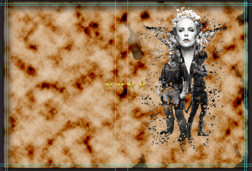
Stars in DVD Inlay
I used the Free Transform again with the DVD inlay to move the ratings and positioned it within the top right corner of the inlay.
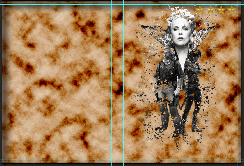
Stars in position by Free Transform
I then doubled clicked on the star ratings in the layer panel which brought up the Blending Menu. In this menu I changed the Blend Option and Inner Shadow . For the Blend Mode I changed the Blending Options from Normal > Colour Burn. I
choose this blend mode because I wanted the ratings to look like that
they are blended in with the paper. This was the only item I changed
within the blend mode.
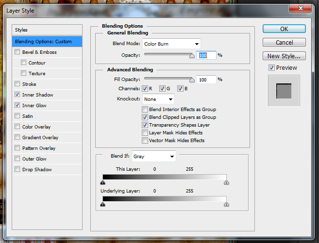
Blending Option Settings
The Inner Shadow settings I changed quite a bit in this setting. First of all I changed the blend mode from Normal > Linear Burn, this
added a little black boarder to the stars. This was so that the ratings
did not look too blended into the paper, but also gives it that edge. I
also changed the size and choke of the inner shadow so you are able to
see it and a little noise to add a little texture. Here are the settings
I used for this.
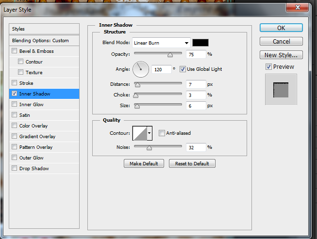
Inner Show Settings
The four star rating should now look like this.

Stars with Blending Option and Inner Shadow
For the five star rating I went back into the star document and then pasted another star onto the canvas. I did this again via Edit > Paste Special > Paste in Place. I again used the Free Transform to re position the new star and Merged the Layers.

Five stars with merged layers
I again used the Rectangular Marquee Tool to select all the stars and copied via Ctrl + Cand pasted it into the DVD inlay again via Edit > Paste Special > Paste in Place. The image should then be displayed in the DVD inlay.

Stars within the Inlay
I then again used the Free Transform to
move the rating into the top left hand corner of the front cover of the
DVD inlay. I then changed the blending settings to the exact same
settings as the four star rating. So the ratings should look like this
so far.
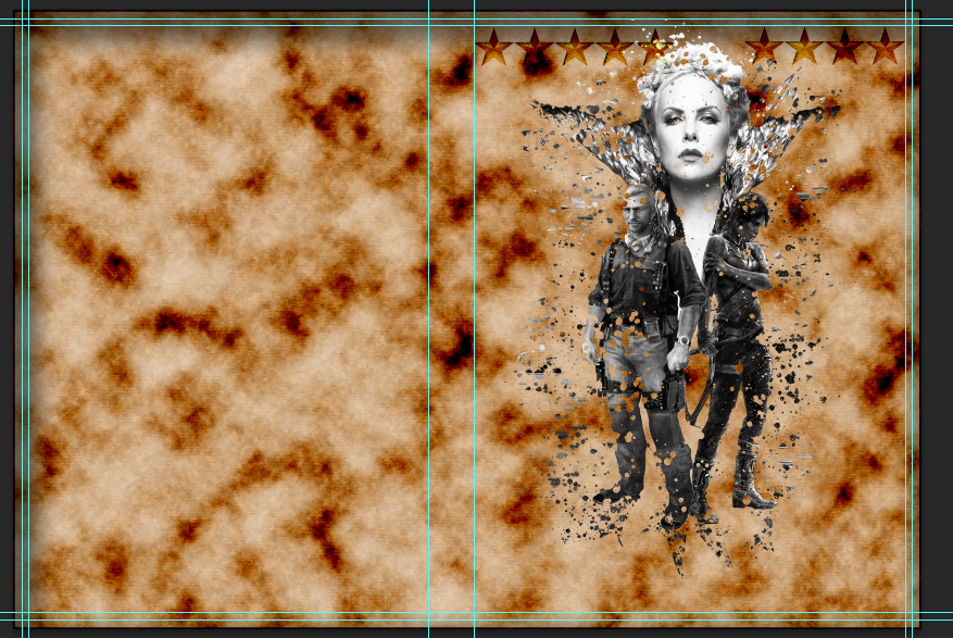
Ratings so far
I then added the name of the magazines/newspaper titles to go underneath the ratings. To do this I would use the Text Tool. I selected the icon which looks like a T.

Text Tool Icon
I
then clicked underneath the four star rating and then typed 'Empire'. I
then highlighted the text and changed the size of the text to 18 and
the text font to Lucida Calligraphy . I then selected the text and moved it position via Free Transform.

Text underneath the rating
I
did the same for the five rating but typed in 'Independent' and then
changed the text size and font to the same style. I again selected the
text and moved its position via Free Transform.
Here is what the final result of the ratings will look like.
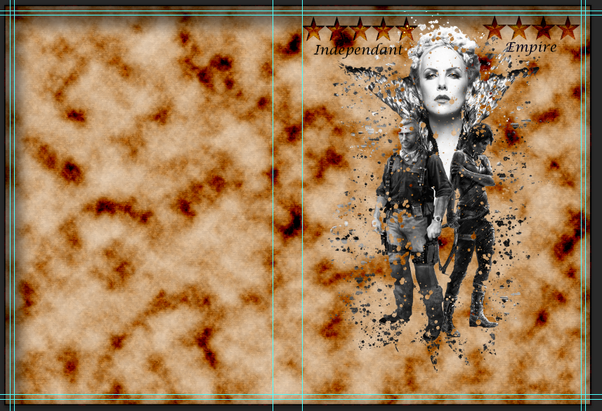
Finished Ratings
Ratings
Here are the tools/effects that I will be using within this part of the design:
- Rectangular Marquee Tool
- Free Transform
- Blend Option
- Inner Shadow
- Inner Glow
- Text Tool
Now
the splatter effect is created I can now move on to creating the
ratings for the design. First of all I will need to sort the image out
which I will be using to create the ratings.
First of all I opened the star image in Photoshop. I then re-sized the canvas, this was so that all of the stars would fit on the same document. I did this by going into Image > Resize Canvas. I changed the the size of the canvas to 350 x 71 mm .
I then selected the Rectangular Marquee Tool and
used the tool by drawing around the the star that is already on the
canvas. I used this tool because it was easier to use than the other
selection tools because it was such a simple picture. So I did not need
to use the other selection tools that are used for really detailed
images to select it.
I then copied the image by pressing Ctrl + J. I then pasted the image three times onto the canvas by clicking Edit > Paste Special > Paste In Place. The three stars will then be pasted onto the document in their own layers.
[Image]
I then moved the newly pasted stars into position using the Free Transform. I clicked onEdit > Free Transform and moved the images into place.
Now
that the images are in place I will now merge the layers together. This
is because if I selected all the stars on the canvas and copied and
pasted across only one star will be pasted across; this will be due to
only one layer being selected. To merge the layers down I clicked on the
top layer and right clicked and then selected Merge Down. I did this for each layer till all the stars were in one layer.
Now all the stars are in place I used the Rectangle Marquee Tool again and drew a rectangle around the stars.
I then clicked Ctrl + C to copy the image and then went into the DVD inlay panel via the tabs. I then pasted the image into the inlay by clicking Edit > Paste Special > Paste in Place. The first rating should look like this on the inlay.
I used the Free Transform again with the DVD inlay to move the ratings and positioned it within the top right corner of the inlay.
I then doubled clicked on the star ratings in the layer panel which brought up the Blending Menu. In this menu I changed the Blend Option and Inner Shadow . For the Blend Mode I changed the Blending Options from Normal > Colour Burn. I
choose this blend mode because I wanted the ratings to look like that
they are blended in with the paper. This was the only item I changed
within the blend mode.
The Inner Shadow settings I changed quite a bit in this setting. First of all I changed the blend mode from Normal > Linear Burn, this
added a little black boarder to the stars. This was so that the ratings
did not look too blended into the paper, but also gives it that edge. I
also changed the size and choke of the inner shadow so you are able to
see it and a little noise to add a little texture. Here are the settings
I used for this.
The four star rating should now look like this.
First of all I opened the star image in Photoshop. I then re-sized the canvas, this was so that all of the stars would fit on the same document. I did this by going into Image > Resize Canvas. I changed the the size of the canvas to 350 x 71 mm .
 |
| Canvas resized to 350 x 71 mm |
 |
| Star selected with the Rectangular Marquee Tool |
[Image]
I then moved the newly pasted stars into position using the Free Transform. I clicked onEdit > Free Transform and moved the images into place.
 |
| Stars in Place |
 |
| Layers merged into one |
 |
| Stars selected with the Rectangular Marquee Tool |
 |
| Stars in DVD Inlay |
 |
| Stars in position by Free Transform |
 |
| Blending Option Settings |
 |
| Inner Show Settings |
 |
| Stars with Blending Option and Inner Shadow |
For the five star rating I went back into the star document and then pasted another star onto the canvas. I did this again via Edit > Paste Special > Paste in Place. I again used the Free Transform to re position the new star and Merged the Layers.
I again used the Rectangular Marquee Tool to select all the stars and copied via Ctrl + Cand pasted it into the DVD inlay again via Edit > Paste Special > Paste in Place. The image should then be displayed in the DVD inlay.
I then again used the Free Transform to
move the rating into the top left hand corner of the front cover of the
DVD inlay. I then changed the blending settings to the exact same
settings as the four star rating. So the ratings should look like this
so far.
I then added the name of the magazines/newspaper titles to go underneath the ratings. To do this I would use the Text Tool. I selected the icon which looks like a T.
I
then clicked underneath the four star rating and then typed 'Empire'. I
then highlighted the text and changed the size of the text to 18 and
the text font to Lucida Calligraphy . I then selected the text and moved it position via Free Transform.
I
did the same for the five rating but typed in 'Independent' and then
changed the text size and font to the same style. I again selected the
text and moved its position via Free Transform.
Here is what the final result of the ratings will look like.
 |
| Five stars with merged layers |
 |
| Stars within the Inlay |
 |
| Ratings so far |
| Text Tool Icon |
 |
| Text underneath the rating |
Here is what the final result of the ratings will look like.
 |
| Finished Ratings |
DVD Inlay Cover [Front & Spine] Step by Step - Film Title
Faded Title
Front Cover Title
Here are the tools/effects that I will be using within this part of the design:
- Text Tool
- Free Transform
- Layer Mask
- Eraser
Now I have completed the ratings I can now move onto the title of the film. To create this I started out with selecting the Text Tool. I selected the text tool by clicking on the T icon.

Text Tool Icon
I
then clicked on the DVD Inlay underneath the splatter effect a new
layer was created when I clicked. I then began to type the title 'Page
Travelers'.

The title typed onto the DVD inlay
Once I had typed the title I highlighted it and changed the font to God of War. I
choose this font mainly because I liked the look of it within the
Ancient Ink tutorial and I decided to keep it on. This is because it
actually does look like a really old text font which was good for the
old theme I am after. I also changed the size to 32 . Once I was happy
with the font and size I changed the position of the text with the Free Transform tool. I went to Edit > Free Transform. I moved the title till I was happy with the position
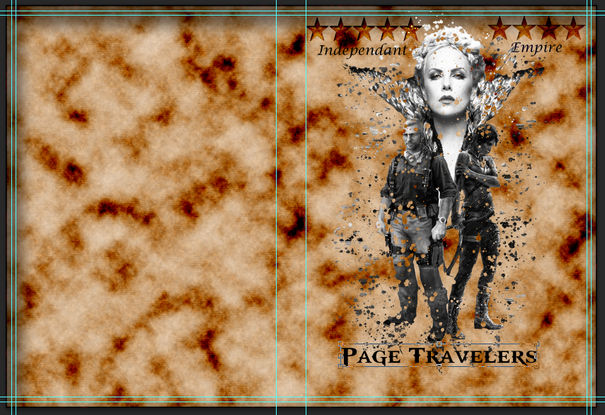
Title in position with new font and size
Now to create the faded effect. I started by selecting the title layer and created a Layer Mask. To
add the layer mask I clicked on the rectangle icon with a circle in the
middle located in the bottom right corner of the layer panel.

Layer Mask icon
Now
the layer mask has been added I started to create the fade effect. I
added a layer mask at this point because I did not want the editing of
the title to also effect the paper background or the other effects
around it. But also it also counts as non-destructive editing, meaning
that if I was not happy with the editing I can just delete the layer
mask; also if something went wrong it would be easy for me to undo.
To start the faded effect off I started by clicking on the layer mask and choosing theEraser. I selected the eraser by clicking on the rubber icon and made sure the colour was selected in the colour panel.

Eraser Icon
I
then went and selected the type of rubber I wanted to use. I choose
chalk rubber number 11. I choose this rubber because it worked really
well within the tutorial and it made the writing look really effective. I
then began to rub out parts of the lettering within the title enough
that it made it look worn, but enough that you can still see the title
clearly.
Chalk brush 11
Here is the finished results for the front cover title.
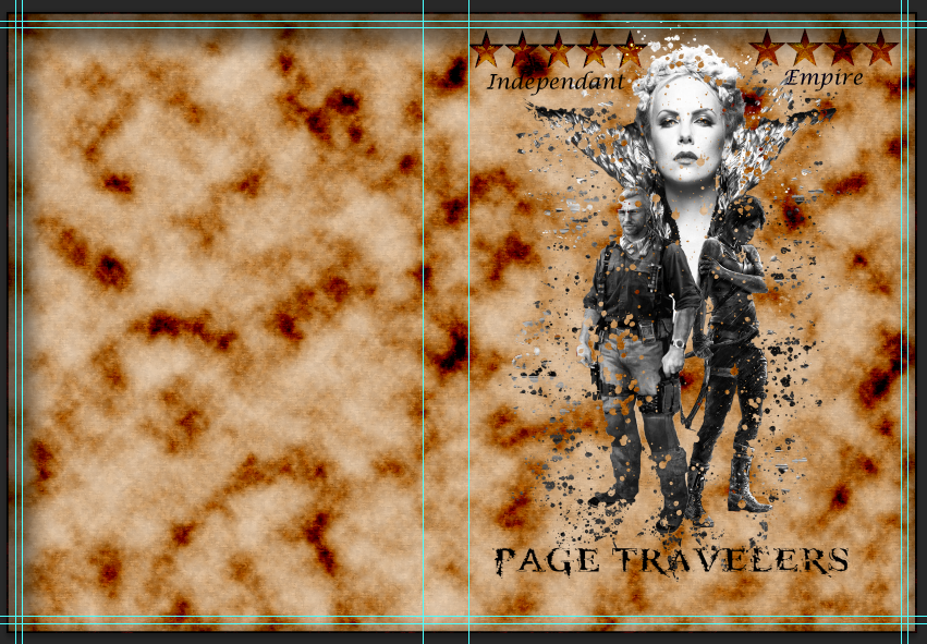
Front panel title finished
Spine Title
I
am now going to be using the same effect for the title on the spine of
the cover. So I decided to do this straight after making the title on
the front cover because I know the kind of effect that I wanted and I
have already created. So it was just a case of reproducing it.
To start I clicked on the title layer of the front over and right clicked on the layer and selected Duplicate Layer. This then created an exact replica of the title.

Layer been duplicated
After
the title has been duplicated I then selected the new layer and rotated
and re positioned the text onto the spine of the cover by using the Free Transform.
Here is the final result.

Finished Title on spine
Faded Title
Front Cover Title
Front Cover Title
Here are the tools/effects that I will be using within this part of the design:
I
then clicked on the DVD Inlay underneath the splatter effect a new
layer was created when I clicked. I then began to type the title 'Page
Travelers'.
Once I had typed the title I highlighted it and changed the font to God of War. I
choose this font mainly because I liked the look of it within the
Ancient Ink tutorial and I decided to keep it on. This is because it
actually does look like a really old text font which was good for the
old theme I am after. I also changed the size to 32 . Once I was happy
with the font and size I changed the position of the text with the Free Transform tool. I went to Edit > Free Transform. I moved the title till I was happy with the position
Now to create the faded effect. I started by selecting the title layer and created a Layer Mask. To
add the layer mask I clicked on the rectangle icon with a circle in the
middle located in the bottom right corner of the layer panel.
Now
the layer mask has been added I started to create the fade effect. I
added a layer mask at this point because I did not want the editing of
the title to also effect the paper background or the other effects
around it. But also it also counts as non-destructive editing, meaning
that if I was not happy with the editing I can just delete the layer
mask; also if something went wrong it would be easy for me to undo.
To start the faded effect off I started by clicking on the layer mask and choosing theEraser. I selected the eraser by clicking on the rubber icon and made sure the colour was selected in the colour panel.
I
then went and selected the type of rubber I wanted to use. I choose
chalk rubber number 11. I choose this rubber because it worked really
well within the tutorial and it made the writing look really effective. I
then began to rub out parts of the lettering within the title enough
that it made it look worn, but enough that you can still see the title
clearly.
Here is the finished results for the front cover title.
I am now going to be using the same effect for the title on the spine of the cover. So I decided to do this straight after making the title on the front cover because I know the kind of effect that I wanted and I have already created. So it was just a case of reproducing it.
To start I clicked on the title layer of the front over and right clicked on the layer and selected Duplicate Layer. This then created an exact replica of the title.
After
the title has been duplicated I then selected the new layer and rotated
and re positioned the text onto the spine of the cover by using the Free Transform.
Here is the final result.
- Text Tool
- Free Transform
- Layer Mask
- Eraser
| Text Tool Icon |
 |
| The title typed onto the DVD inlay |
 |
| Title in position with new font and size |
| Layer Mask icon |
To start the faded effect off I started by clicking on the layer mask and choosing theEraser. I selected the eraser by clicking on the rubber icon and made sure the colour was selected in the colour panel.
| Eraser Icon |
 |
| Chalk brush 11 |
 |
| Front panel title finished |
Spine Title
I am now going to be using the same effect for the title on the spine of the cover. So I decided to do this straight after making the title on the front cover because I know the kind of effect that I wanted and I have already created. So it was just a case of reproducing it.
To start I clicked on the title layer of the front over and right clicked on the layer and selected Duplicate Layer. This then created an exact replica of the title.
 |
| Layer been duplicated |
Here is the final result.
 |
| Finished Title on spine |
DVD Inlay Cover [Back] Step by Step - Back Images, Description, Languages and Logos
Back Panel
Drawn Images
Here are the tools/effects that I will be using within this part of the design:
- Desaturate
- Invert
- Blend Mode
- Gaussian Blur
- Eraser
- Quick Selection Tool
- Levels
- Free Transform
- Warp
- Text Tool
Now
I have completed the front panel it is time to move onto the back
panel. First of all I will need to start by sorting my images out i.e.
which ones I will be using and putting the drawn effect on those
images.
First of all I opened the image of Lara sing a bow I will be using by going into File > Openand then finding the images. When it is open it will open in a new tab within the Photoshop program.
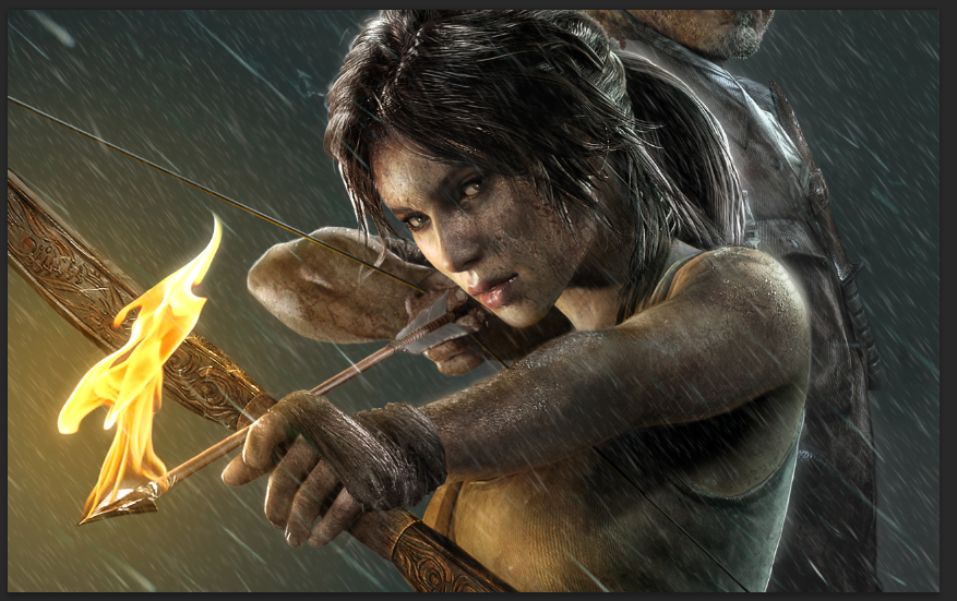
Lara image going to be used
Now
the image I open I can start to create the effect. To start I
duplicated the image by selecting the image layer and clicking Ctrl + J. A new layer will appear in the layer panel with the exact same image.
Duplicated layer
Making sure the new layer I created is still selected I will now Desaurate the image. This will remove the colour of the image and replace the colour with a black & white tone. To do this I went to Image > Adjustments > Desaturate.
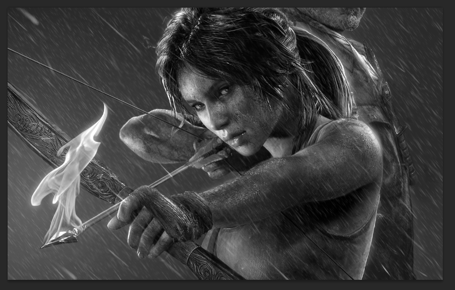
Desaturated image
I then duplicated this layer, again I used Ctrl + J. Making sure that the new layer added is selected I am going to Invert it. To do this I clicked Image > Adjustments > Invert. This inverts the image brightness values by making the light areas dark and the darker areas light; leaving the image negative.
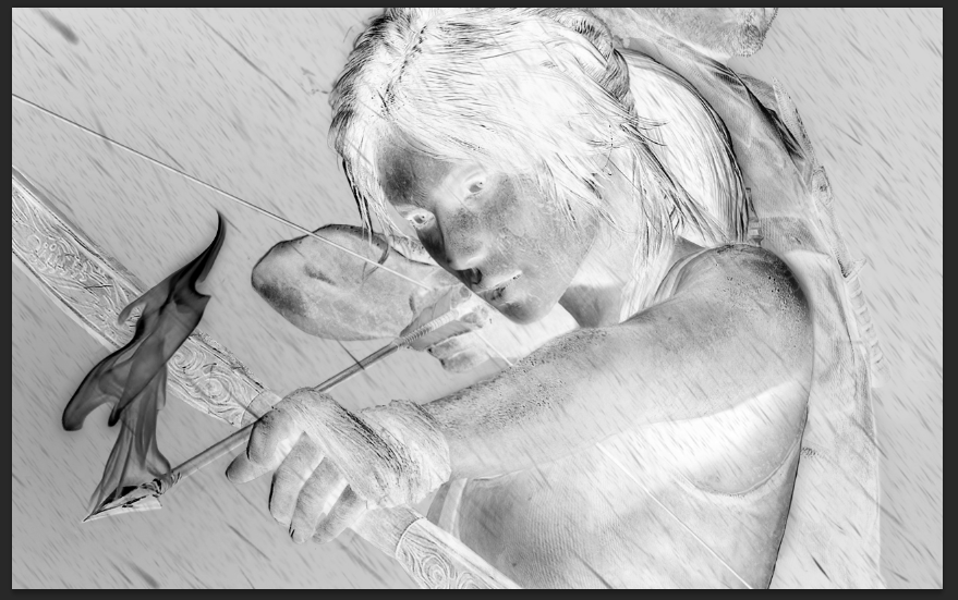
Inverted Image
On the inverted layer I will now change the Blend Mode from Normal > Colour Dodge. This
should then make the document temporarily filled white, there might be
bits of black however is mainly dependent on the image.
Colour Dodge Image
Now to create the sketched look for the image. To do this I used the Gaussian Blur. To select the Gaussian Blur I went to Filter > Blur > Gaussian Blur. The
menu will open up where I will set the intensity (radius) of the sketch
effect. I choose 12.5% because I thought it would be enough that the
original image would not show through, but enough to have the sketched
effect.
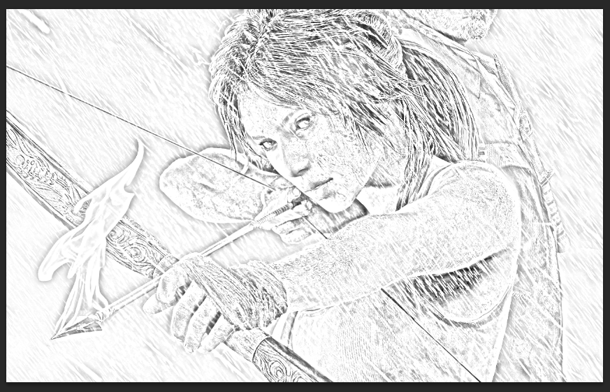
Gaussian Blur
I then merged the layers together. To do this I went to Layer > Merge Visible. This automatically merges all of the layers together into one final layer.
Merged Visible layers
For the next step I will now change the Blend Mode again from Normal > Multiply. The multiply blend will darken the lines of the sketch allowing it to be more visible.
Now I will duplicate the original image by selecting it and then clicking Ctrl + J. I will then drag the copied layer and drag it to the top of the layers.
Duplicated image moved to the top
I then changed the the Blend Mode from Normal > Colour. This
will then add colour to the sketch. I changed the opacity level to 65%,
this is so the colour does not stand out as bright as it was first of
all. I then merged all the layers by right clicking on a layer and
selectingMerge Visible.
Here is the final result.
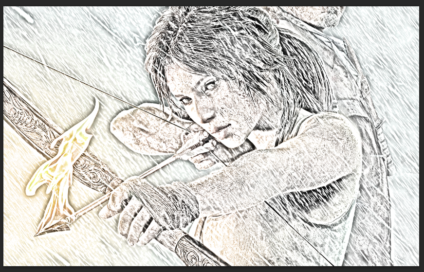
Final Result
Now
to make the image look like a really old drawing on a piece of paper. I
first of all opened a paper texture which I had found via File > Open. This will open up the image in a new tab.
I then used the Quick Selection Tool and
selected the paper and then cut the image from its original background.
To do this I right clicked on the selected area and clicked on Layer via Cut. I will be left with the paper on a transparent background.

Image on transparent background
I then deleted the original background and rotated the image using Image Rotation. I went to Image > Image Rotation > 90 Degrees CW. So that the paper image is now landscape and not portrait.
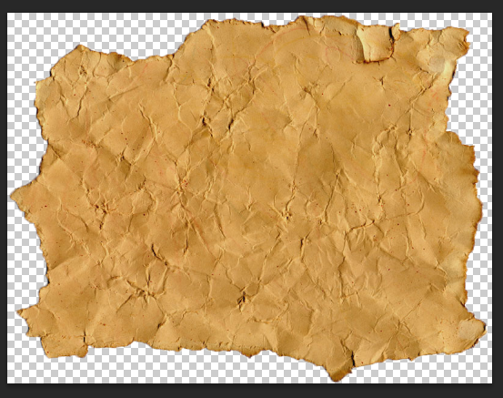
Image rotated
I then went back into the sketch image document and used the Rectangular Marquee Tooland
drew around the edge of the canvas. I used this selection tool over the
others was because I was selecting the whole document and not little
bits of detail. I then copied and pasted the image into the opened paper
document via copy (Ctrl + C) and paste (Edit > Paste Special > Paste in Place).
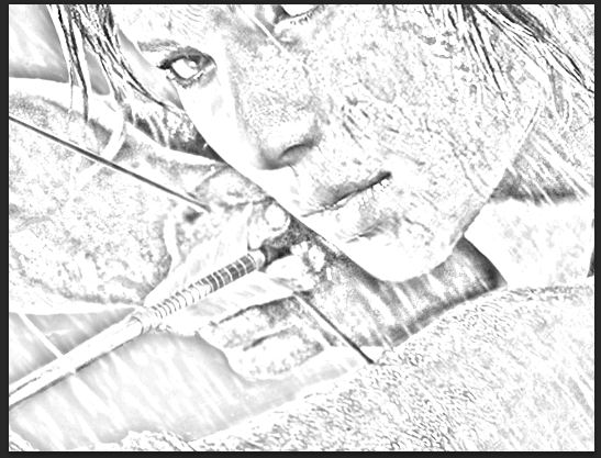
Sketch image pasted on paper image
The image is now in place on the paper document I can now re-size and move the image into position. To do this I used the Free Transform. The image should look like this.
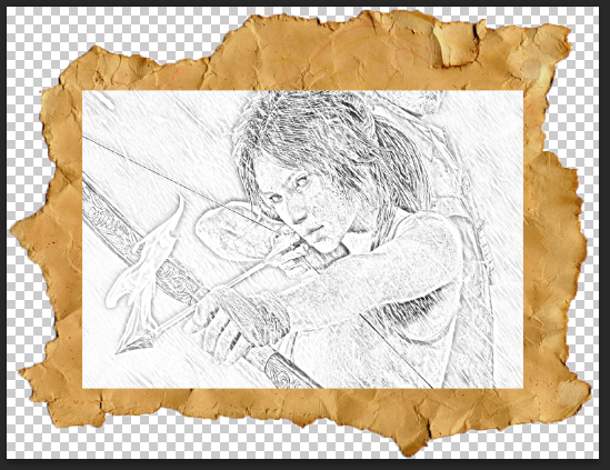
Image re-sized on the piece of paper
To make the image look worn and blend in with the paper. I did this by clicking on the sketch image layer and changed the Blend Mode to Colour Burn.
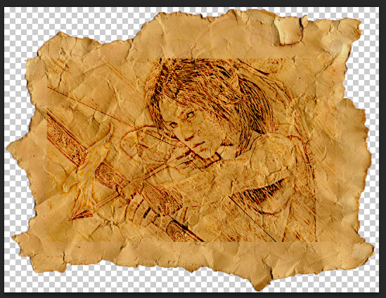
Image merged with the paper
I then used the Eraser on
the sketch layer and erased some of the images to make it look worn and
if parts of the images were erased away. I then merged the layer
together viaMerge Visible. This will then help me transfer the image easily across to the DVD inlay later on.
Here is the final result.
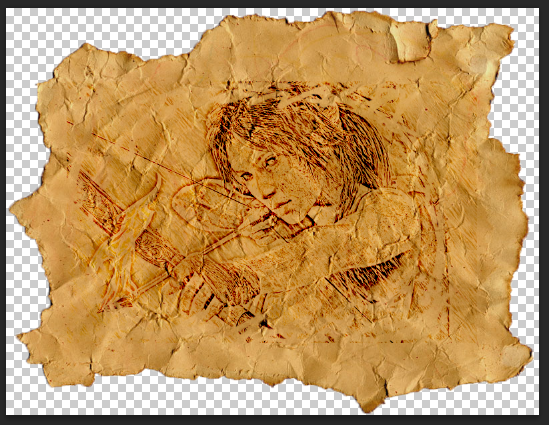
Final image
I then did this process again but with the image of Lara sitting on her bed. Here were the results.
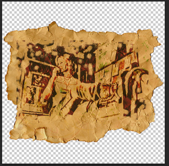
Lara sitting drawing
I
did this again but for the full body image of Lara. However, this time I
had to separate the image from the original background. I did this by
using the Quick Selection Tool and selecting the image. I then right clicked on the image and used Layer Via Cut to
cut the image from the original background. I then deleted the original
back ground layer as it is no longer needed. Here are the final
results.
Layered Paper held Together
Now
I have done the hard part of the back panel which was to create all the
effects I will now move onto the layered paper that is held together in
the top left corner. This is a simple process.
First of all I opened the same paper texture that I used for the drawn images. I did this viaFile > Open. This opened it in a new tab on the Photoshop software.
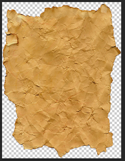
Paper image
I then duplicated this layer by clicking Ctrl + J. This
is because I wanted a few piece of paper to be layered on top of one
another. I then hid the layer I just duplicated and selected the
original paper layer.
I
will now do some destructive editing. I decided to do destructive
editing because once I have edited it I will not be changing it again,
which is why I did not create a layer mask for it. I changed the Levels of the image. To do this I went to Images > Adjustment > Levels. A
menu will open where you are able to change the darkness of the image. I
changed the settings for the image to be quite dark, this is because it
is going to be at the bottom of the pile and I want each layer to be
defined as different layers.
I then unhide the copied layer and also changed the Levels of that piece of paper half way between the darker colour of the paper I just edited and its original colour.
Here is the result.
Middle paper
I then changed the position of the image I just changed the levels with Free Transform. I selected it by going to Edit > Free Transform. I re-positioned the paper so that you could see parts of the darker paper.
Start of the stacking
I then copied (Ctrl + J) and pasted (Edit > Paste Special > Paste in Place) a
image which I changed and added the drawing effect too. This was the
full body image of Lara. I then re-positioned and rotated the image till
I was happy with it.
I
also took and image of a paper clip and pasted it into the document and
erased some of the image and re-positioned it on the paper to look like
that they were being held together.
Here is the final result.
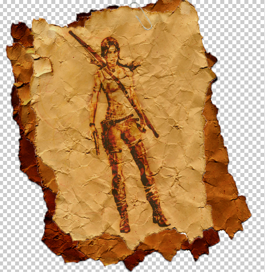
Final stacked paper piece.
Back Paper
This
is the paper that is behind the drawn pictures. This was a simple
process to create because all I did to this image was change the
levels, warped the image and re-positioned it.
I started out by opening the image in Photoshop by going to File > Open and then finding the image.
Paper Image.
I changed the Levels of the paper image. I did this by going to Image > Adjustments > Levels. I changed the settings so that the image is darker to make it look more worn.
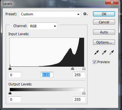
Paper Level settings
Here is the result.
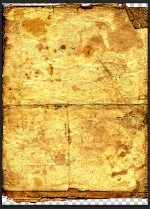
Paper image changed with Levels
I then used the Rectangular Marquee Tool to select the image and then copied (Ctrl + J)and pasted (Edit > Paste Special > Paste in Place) it into the DVD inlay.
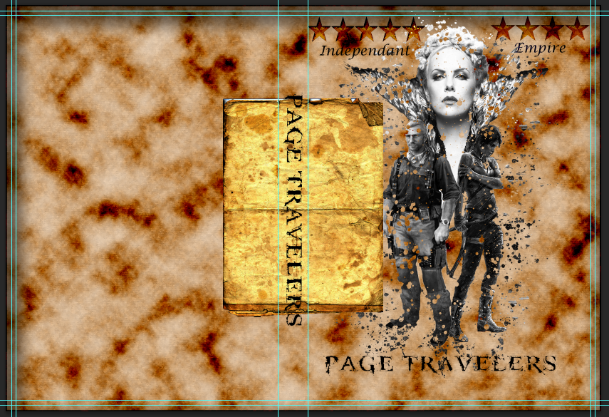
Paper image in the DVD Inlay
Now I changed the position and rotation of the image using the Free Transform into the top left corner of the back panel.
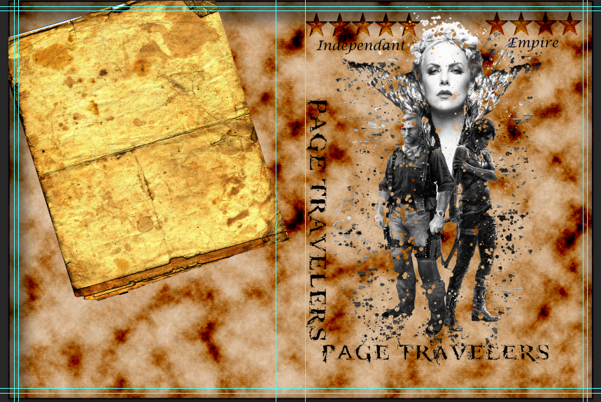
Paper image re-positioned and re-sized in DVD inlay
I
then changed the paper image by making it look like the end is starting
to curl, to make it look more realistic. I did this with the Warp tool, I went to Edit > Transform > Warp.The image will then have a grid around the image this allows you to deform the image. Here were the results.
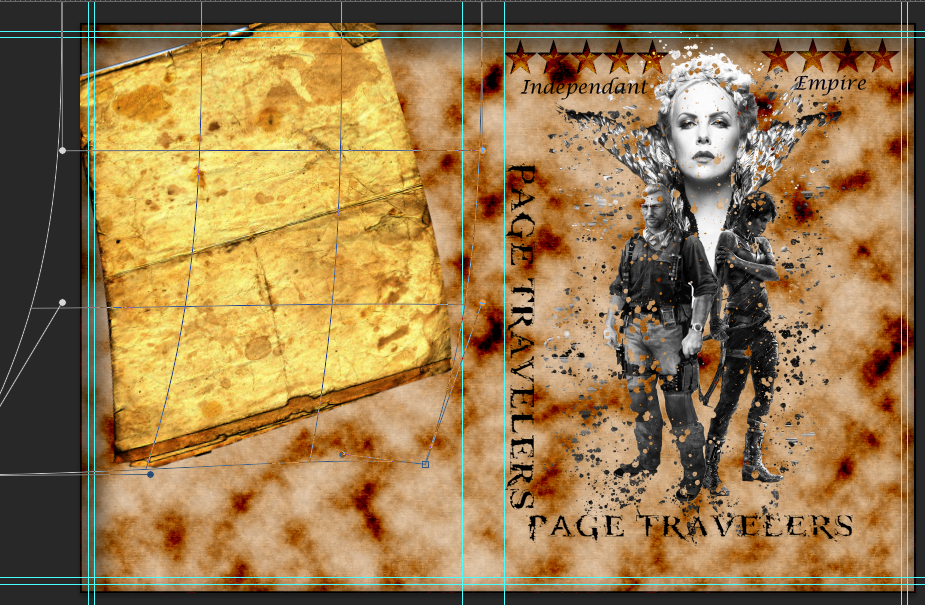
Paper image warped
Bringing the Back Panel Images Together
Now
I have set up the building block of the back panel I will now add add
the elements I have together. To do this I added each image into the DVD
inlay by using the Rectangular Marquee Tool to select the image and then copied (Ctrl + J) and pasted them (Edit > Paste Special > Paste in Place). I then changed the position of the images with the Free Transform. Some parts of the image went into the spine of the image, I then used the Eraser Tool and erased these parts off the spine. I then added some ink paint with theBrush Tool onto the main piece of paper to add a little more effect and make it look a little more realistic.
Here is the result.
Film Description
Now
for the film description which will be placed in the bottom right
corner of the main piece of paper. This was simple to make, it consists
of using the Text Tool and Warp.
First of all I selected the Text Tool and
clicked on the DVD Inlay back cover and I typed in the move description
'Brought up in an orphanage Joanna does not realize about the great
wide world she is about to embark on. She embarks on a tale far beyond
the books that she reads.' I changed the font to Lucida Calligraphy and
the font size to 18.
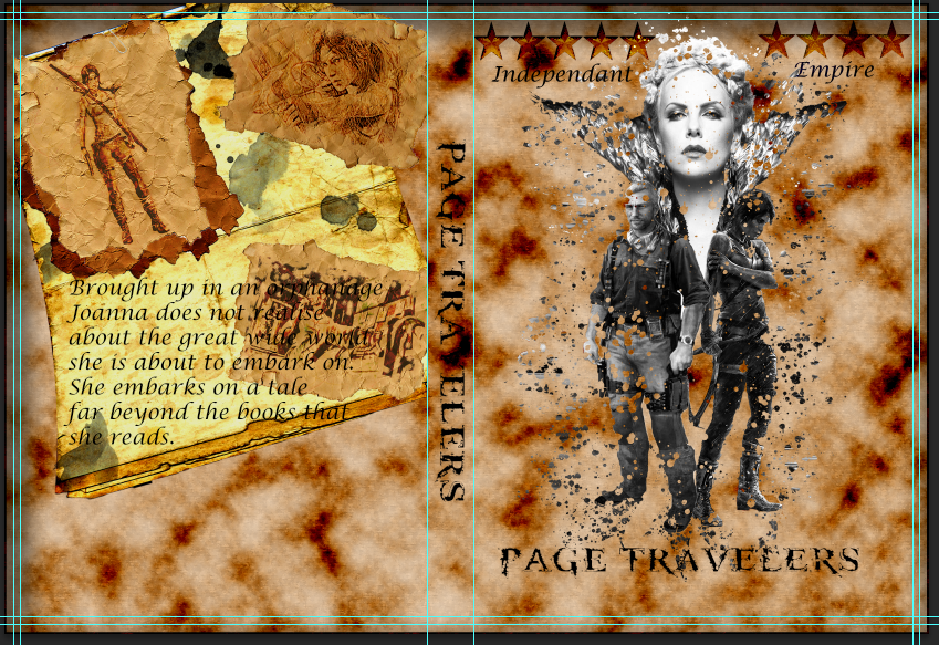
Film Description in on the DVD Inlay
Then I changed the text position with the Warp.
This has allowed me to re-position it and also deform the image so that
it looks like the text is following the flow of the paper. Also, it
will look there is writing on the piece of paper.
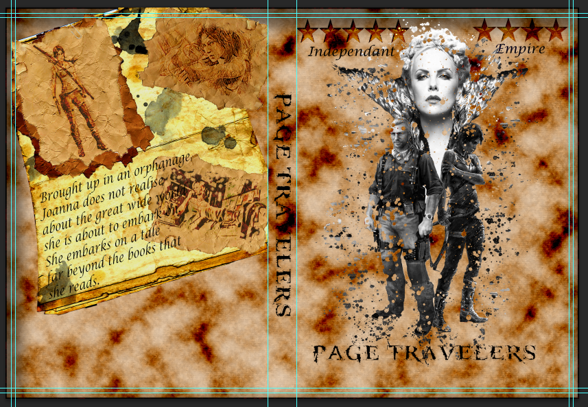
Final results of Film Description
Languages and Logos
For
the final part of the back panel it is placing the languages and logos.
This was very simple to do, especially for the logo's and bar-code.
This was mainly because they were already on a transparent background or
they just needed to be placed straight away in the document. These logo
include: Pegi 15 rating, Irish Rating logo, and DVD Video Logo.
I opened each of the images in Photoshop via File > Open and searching for the image. I then used the Rectangular Marquee Tool to select the images and copied (Ctrl + C) and pasted (Edit > Paste Special > Paste in Place) them into the DVD Inlay. I then re-sized and re-positioned them using the Free Transform.
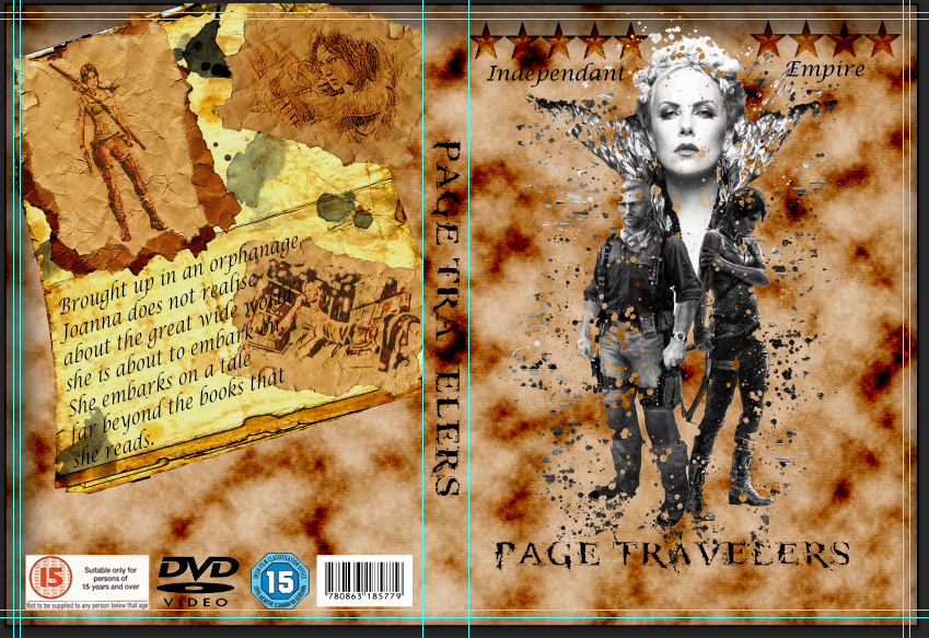
DVD inlay with back panel logos
For the languages I took this from a DVD that already had the information on it. I did this by opening the image and using the Rectangular Marquee Tool and selected the language part of the image. I then put it in its own layer by right clicking and layer Via Cut. I again used the Marquee tool and selected the image and copied (Ctrl + C) and pasted (Edit > Paste Special > Paste In Place) into the DVD Inlay. I then used the Free Transform to move the image into position.
Here is the final result for the Back panel.
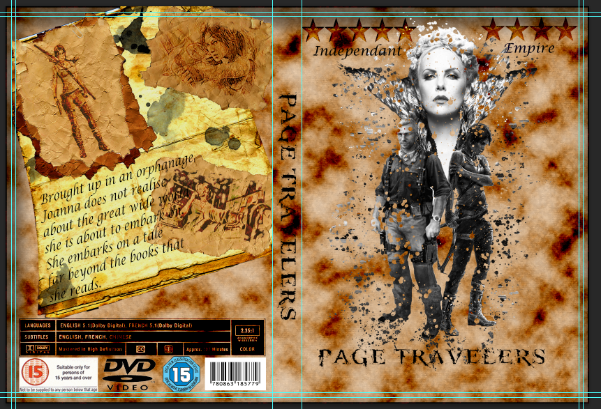
Finished Back Panel
Back Panel
Drawn Images
Here are the tools/effects that I will be using within this part of the design:
- Desaturate
- Invert
- Blend Mode
- Gaussian Blur
- Eraser
- Quick Selection Tool
- Levels
- Free Transform
- Warp
- Text Tool
Now
I have completed the front panel it is time to move onto the back
panel. First of all I will need to start by sorting my images out i.e.
which ones I will be using and putting the drawn effect on those
images.
First of all I opened the image of Lara sing a bow I will be using by going into File > Openand then finding the images. When it is open it will open in a new tab within the Photoshop program.
 |
| Lara image going to be used |
 |
| Duplicated layer |
 |
| Desaturated image |
 |
| Inverted Image |
 |
| Colour Dodge Image |
 |
| Gaussian Blur |
 |
| Merged Visible layers |
Now I will duplicate the original image by selecting it and then clicking Ctrl + J. I will then drag the copied layer and drag it to the top of the layers.
I then changed the the Blend Mode from Normal > Colour. This will then add colour to the sketch. I changed the opacity level to 65%, this is so the colour does not stand out as bright as it was first of all. I then merged all the layers by right clicking on a layer and selectingMerge Visible.
Here is the final result.
 |
| Duplicated image moved to the top |
I then changed the the Blend Mode from Normal > Colour. This will then add colour to the sketch. I changed the opacity level to 65%, this is so the colour does not stand out as bright as it was first of all. I then merged all the layers by right clicking on a layer and selectingMerge Visible.
Here is the final result.
 |
| Final Result |
I then used the Quick Selection Tool and
selected the paper and then cut the image from its original background.
To do this I right clicked on the selected area and clicked on Layer via Cut. I will be left with the paper on a transparent background.
I then deleted the original background and rotated the image using Image Rotation. I went to Image > Image Rotation > 90 Degrees CW. So that the paper image is now landscape and not portrait.
I then went back into the sketch image document and used the Rectangular Marquee Tooland
drew around the edge of the canvas. I used this selection tool over the
others was because I was selecting the whole document and not little
bits of detail. I then copied and pasted the image into the opened paper
document via copy (Ctrl + C) and paste (Edit > Paste Special > Paste in Place).
 |
| Image on transparent background |
 |
| Image rotated |
 |
| Sketch image pasted on paper image |
 |
| Image re-sized on the piece of paper |
 |
| Image merged with the paper |
Here is the final result.
 |
| Final image |
 |
| Lara sitting drawing |
Layered Paper held Together
Now
I have done the hard part of the back panel which was to create all the
effects I will now move onto the layered paper that is held together in
the top left corner. This is a simple process.
First of all I opened the same paper texture that I used for the drawn images. I did this viaFile > Open. This opened it in a new tab on the Photoshop software.
 |
| Paper image |
I
will now do some destructive editing. I decided to do destructive
editing because once I have edited it I will not be changing it again,
which is why I did not create a layer mask for it. I changed the Levels of the image. To do this I went to Images > Adjustment > Levels. A
menu will open where you are able to change the darkness of the image. I
changed the settings for the image to be quite dark, this is because it
is going to be at the bottom of the pile and I want each layer to be
defined as different layers.
I then unhide the copied layer and also changed the Levels of that piece of paper half way between the darker colour of the paper I just edited and its original colour.
Here is the result.
 |
| Middle paper |
 |
| Start of the stacking |
I also took and image of a paper clip and pasted it into the document and erased some of the image and re-positioned it on the paper to look like that they were being held together.
Here is the final result.
 |
| Final stacked paper piece. |
Back Paper
This
is the paper that is behind the drawn pictures. This was a simple
process to create because all I did to this image was change the
levels, warped the image and re-positioned it.
I started out by opening the image in Photoshop by going to File > Open and then finding the image.
I changed the Levels of the paper image. I did this by going to Image > Adjustments > Levels. I changed the settings so that the image is darker to make it look more worn.
Here is the result.
I then used the Rectangular Marquee Tool to select the image and then copied (Ctrl + J)and pasted (Edit > Paste Special > Paste in Place) it into the DVD inlay.
Now I changed the position and rotation of the image using the Free Transform into the top left corner of the back panel.
I
then changed the paper image by making it look like the end is starting
to curl, to make it look more realistic. I did this with the Warp tool, I went to Edit > Transform > Warp.The image will then have a grid around the image this allows you to deform the image. Here were the results.
I started out by opening the image in Photoshop by going to File > Open and then finding the image.
 |
| Paper Image. |
 |
| Paper Level settings |
 |
| Paper image changed with Levels |
I then used the Rectangular Marquee Tool to select the image and then copied (Ctrl + J)and pasted (Edit > Paste Special > Paste in Place) it into the DVD inlay.
 |
| Paper image in the DVD Inlay |
Now I changed the position and rotation of the image using the Free Transform into the top left corner of the back panel.
 |
| Paper image re-positioned and re-sized in DVD inlay |
 |
| Paper image warped |
Bringing the Back Panel Images Together
Now
I have set up the building block of the back panel I will now add add
the elements I have together. To do this I added each image into the DVD
inlay by using the Rectangular Marquee Tool to select the image and then copied (Ctrl + J) and pasted them (Edit > Paste Special > Paste in Place). I then changed the position of the images with the Free Transform. Some parts of the image went into the spine of the image, I then used the Eraser Tool and erased these parts off the spine. I then added some ink paint with theBrush Tool onto the main piece of paper to add a little more effect and make it look a little more realistic.
Here is the result.
Here is the result.
Film Description
Now for the film description which will be placed in the bottom right corner of the main piece of paper. This was simple to make, it consists of using the Text Tool and Warp.
First of all I selected the Text Tool and clicked on the DVD Inlay back cover and I typed in the move description 'Brought up in an orphanage Joanna does not realize about the great wide world she is about to embark on. She embarks on a tale far beyond the books that she reads.' I changed the font to Lucida Calligraphy and the font size to 18.
 |
| Film Description in on the DVD Inlay |
 |
| Final results of Film Description |
Languages and Logos
For the final part of the back panel it is placing the languages and logos. This was very simple to do, especially for the logo's and bar-code. This was mainly because they were already on a transparent background or they just needed to be placed straight away in the document. These logo include: Pegi 15 rating, Irish Rating logo, and DVD Video Logo.
I opened each of the images in Photoshop via File > Open and searching for the image. I then used the Rectangular Marquee Tool to select the images and copied (Ctrl + C) and pasted (Edit > Paste Special > Paste in Place) them into the DVD Inlay. I then re-sized and re-positioned them using the Free Transform.
 |
| DVD inlay with back panel logos |
Here is the final result for the Back panel.
 |
| Finished Back Panel |
DVD Inlay Cover [Spine & Front] Step by Step - Finishing Touches
Finishing Touches
Here are the tools/effects that I will be using within this part of the design:
- Rectangular Marquee Tool
- Free Transform
- Paint Brushes
Seeming
that the back panel is complete there are a few little details I need
to add before I have completely finish my design. These will be done on
the Front cover and the spine.
Pegi logo
First
of all I added the Pegi Rating logo. This is because I will be using it
on both the spine and front cover. I opened the image in Photoshop via File > Open and then searched for the file. It opened within a new tab in the software.
Pegi 15 logo
I then used the Rectangular Marquee Tool to draw around the image. I
used this tool because the image was already on a transparent
background so I did not have to use the other selection tools
to separate it from its background.
Logo Selected with the Rectangular Marquee Tool
I then copied the image by clicking Ctrl + J. I then went into the DVD inlay and pasted the image into the document by going to Edit > Paste Special > Paste in Place.
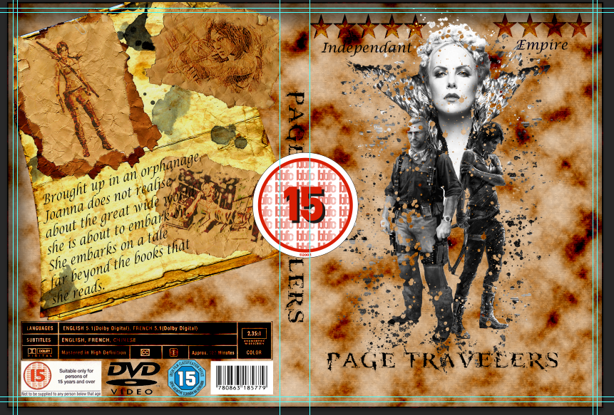
Image in the DVD Inlay
Then
I re-sized and re positioned the image. I started with the spine, this
is because on most DVD covers the rating on the spine is the same size
as those that are on the front, unless they have re-sized it for a
purpose! I did this by using the Free Transform.
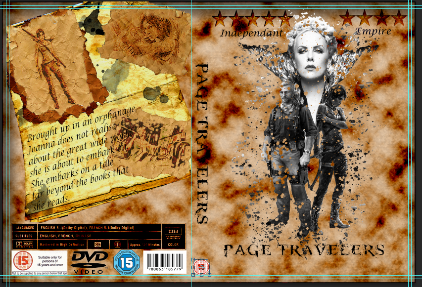
Image re-sized and positioned in free transform mode
Once
I re-positioned the logo I copied and the image and pasted it and
re-positioned it like I did for the spine. However, this time I moved it
to the front cover in the bottom left hand corner.
Here is the finished results for the Pegi logo.
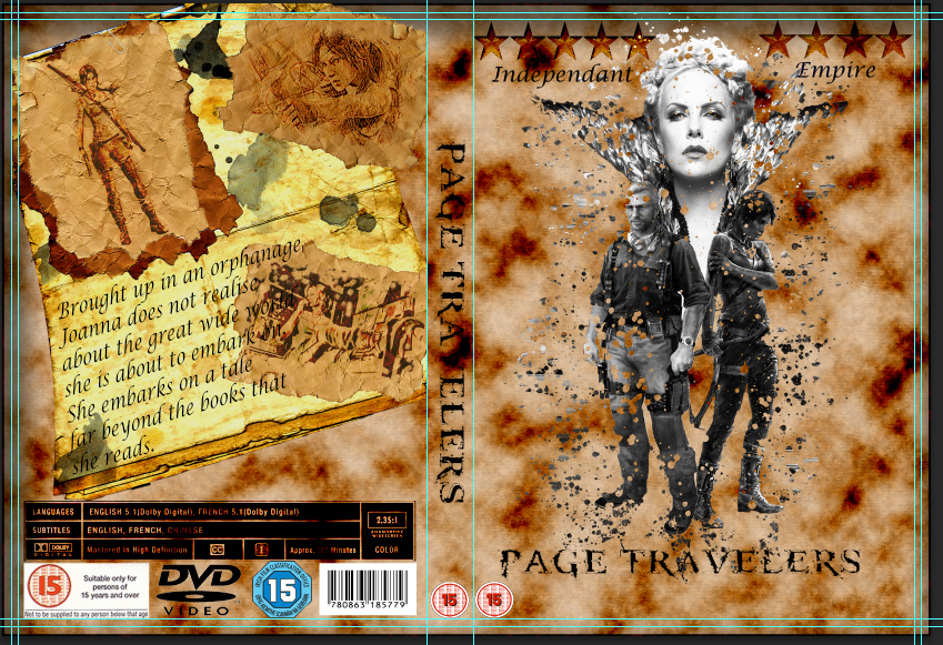
Finished results for Pegi Logo
DVD/Video Logo [Spine]
For
this logo it was a simple task to place it on the top of the spine. All
I did was select the DVD/Video logo from the back panel and copied (Ctrl + J) and pasted (Edit > Paste Special > Paste In Place). This will pate it into another layer, I then re-seized and re-positioned the image with the free transform (Edit > Free Transform).
Here is the result.
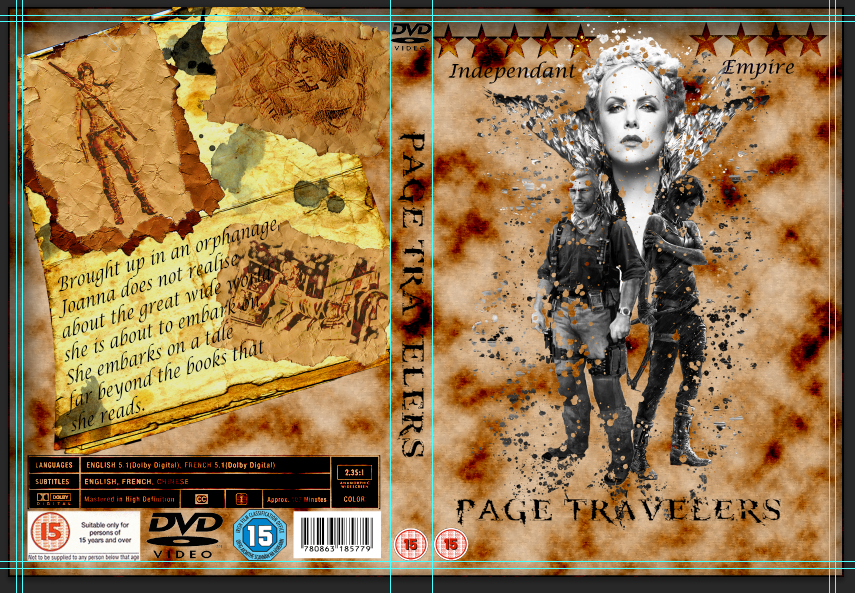
DVD logo on the spine
Ink Brushes
For
the final touch to the whole design I added a few paint ink brush
effects to the front cover. I did this to add a little effect to the
front cover so that it would not look too plain; but also so that it is
not losing out on the theme. I did not over load the cover with the
brush effect because it would be too much and over power the effects
that are there already.
I did this by selecting the Brush Tool and then selected paints brushes which I downloaded and were used within the Ancient Text tutorial.
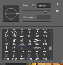
Ink paint brushes
I
created a new layer before applying the paint by clicking on the little
icon which looks like a post-it note at the bottom of the layer panel. I
did this because if the effect did not look right then I can just
delete the layer saving me time undoing everything.

New Layer Icon
I experimented with the brush till I was happy with the results. Here is the overall finished design.
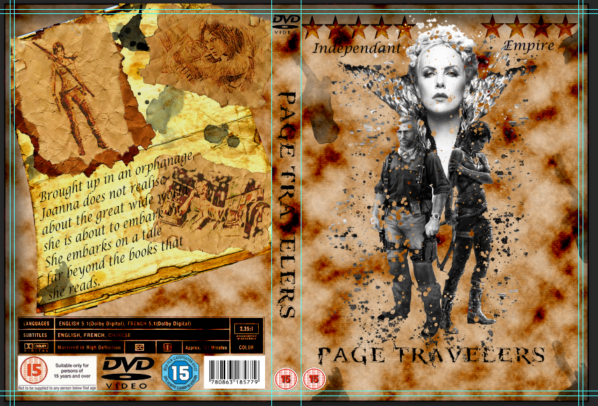
The finished DVD inlay with Ink Paint brush effects
Finishing Touches
Here are the tools/effects that I will be using within this part of the design:
- Rectangular Marquee Tool
- Free Transform
- Paint Brushes
Seeming
that the back panel is complete there are a few little details I need
to add before I have completely finish my design. These will be done on
the Front cover and the spine.
First
of all I added the Pegi Rating logo. This is because I will be using it
on both the spine and front cover. I opened the image in Photoshop via File > Open and then searched for the file. It opened within a new tab in the software.
I then used the Rectangular Marquee Tool to draw around the image. I
used this tool because the image was already on a transparent
background so I did not have to use the other selection tools
to separate it from its background.
I then copied the image by clicking Ctrl + J. I then went into the DVD inlay and pasted the image into the document by going to Edit > Paste Special > Paste in Place.
Then
I re-sized and re positioned the image. I started with the spine, this
is because on most DVD covers the rating on the spine is the same size
as those that are on the front, unless they have re-sized it for a
purpose! I did this by using the Free Transform.
Once
I re-positioned the logo I copied and the image and pasted it and
re-positioned it like I did for the spine. However, this time I moved it
to the front cover in the bottom left hand corner.
Pegi logo
 |
| Pegi 15 logo |
 |
| Logo Selected with the Rectangular Marquee Tool |
 |
| Image in the DVD Inlay |
 |
| Image re-sized and positioned in free transform mode |
Here is the finished results for the Pegi logo.
 |
| Finished results for Pegi Logo |
DVD/Video Logo [Spine]
For
this logo it was a simple task to place it on the top of the spine. All
I did was select the DVD/Video logo from the back panel and copied (Ctrl + J) and pasted (Edit > Paste Special > Paste In Place). This will pate it into another layer, I then re-seized and re-positioned the image with the free transform (Edit > Free Transform).
Here is the result.
 |
| DVD logo on the spine |
Ink Brushes
For
the final touch to the whole design I added a few paint ink brush
effects to the front cover. I did this to add a little effect to the
front cover so that it would not look too plain; but also so that it is
not losing out on the theme. I did not over load the cover with the
brush effect because it would be too much and over power the effects
that are there already.
I did this by selecting the Brush Tool and then selected paints brushes which I downloaded and were used within the Ancient Text tutorial.
 |
| Ink paint brushes |
I
created a new layer before applying the paint by clicking on the little
icon which looks like a post-it note at the bottom of the layer panel. I
did this because if the effect did not look right then I can just
delete the layer saving me time undoing everything.
 |
| New Layer Icon |
I experimented with the brush till I was happy with the results. Here is the overall finished design.
 |
| The finished DVD inlay with Ink Paint brush effects |


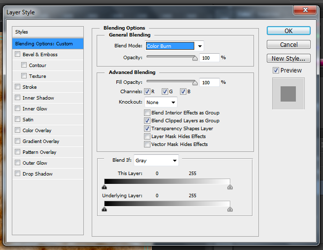


No comments:
Post a Comment